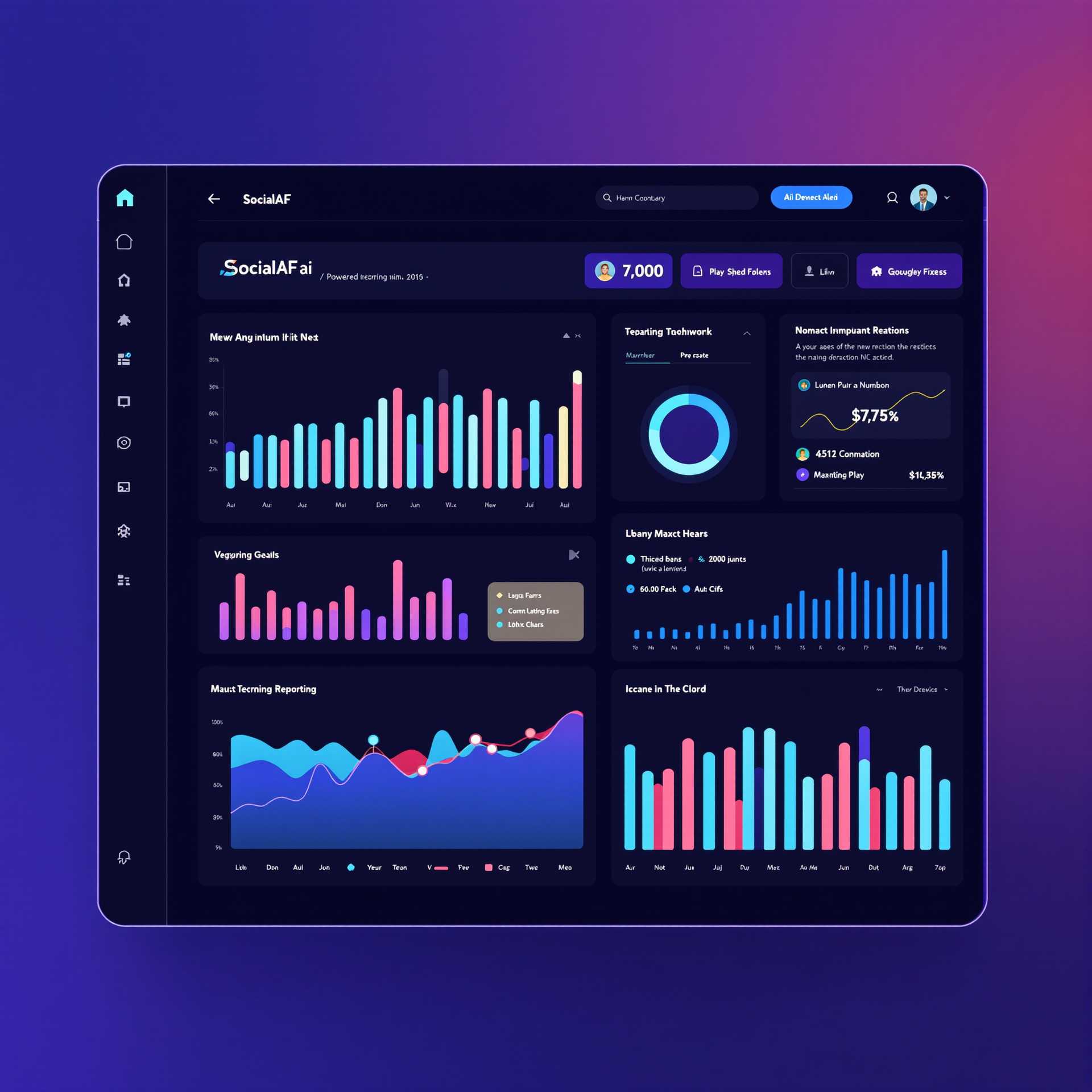
SocialAF Data Dashboard Interface
Generation Details
- Model
- Flux Pro 1.1 Ultra
- Prompt
- create an advanced ai powered reporting dashboard for a site called SocialAF.ai
- Resolution
- 2048x2048
Description
**Description:** The image depicts a modern, sleek dashboard interface for a hypothetical application named "SocialAF." The dashboard is rich with various data visualizations, including bar charts, line graphs, and pie charts, all set against a dark-themed background with vibrant accents. **Visual Analysis:** - **Lighting:** The lighting is soft and ambient, with highlights on the interface elements to create depth and focus. Shadows are minimal, contributing to a clean and professional look. - **Colors:** The color palette is dominated by dark blues and purples for the background, with bright accents in cyan, pink, and yellow. These colors are used to highlight data points and interactive elements, making them stand out against the dark backdrop. - **Composition:** The layout is grid-based, with a sidebar on the left for navigation and multiple panels on the right displaying different types of data visualizations. The arrangement is balanced, with each panel clearly separated yet visually connected through consistent color and style. **Style and Mood:** - **Art Style:** The design leans towards modern minimalism with a focus on functionality. The use of flat design principles and geometric shapes for the charts reflects contemporary UI/UX trends. - **Atmosphere:** The mood is professional and efficient, aimed at users who need to quickly interpret data. The vibrant colors against the dark background evoke a sense of alertness and engagement. - **Visual Impact:** The dashboard is visually striking due to its color contrast and the clarity of the data presented. It's designed to be user-friendly, with an emphasis on readability and quick data assimilation. **Technical Details:** - **Quality:** The image is high-resolution, with sharp lines and clear text, ensuring all elements are legible and visually appealing. - **Techniques:** The use of vector graphics for charts and icons ensures scalability without loss of quality. The interface employs subtle animations and transitions, suggested by the design, to enhance user interaction. - **Special Features:** Notable features include a dynamic color-coding system for different data sets, interactive elements like buttons and tabs, and a comprehensive yet uncluttered layout that maximizes information density without overwhelming the user.
Creator
PixelDojo User
Engagement
Related Images


Create Your Own AI Masterpieces
Inspired by this Flux Pro 1.1 Ultra creation? Join thousands of creators with access to 50+ premium AI tools for professional-quality results.