Headlines, logos, labels
Best-in-Class Text
Put the exact words in quotes and Ideogram 4 renders them crisply and in the right place — wordmarks, posters, packaging labels, UI copy. The standout reason to pick it over a general image model.
Ideogram 4 is the model to reach for when the words have to be right. Best-in-class text rendering, stunning realism, and bold design sense — across three tiers (Turbo, Balanced, Quality). This guide shows how to prompt it for posters, logos, branding, and photoreal work.
Ideogram 4.0 is a text-to-image model with a reputation built on one thing other models still fumble: legible, well-placed text. v4 sharpens that further — cleaner letterforms, better prompt-to-image alignment, stronger photorealism, and support for higher resolutions and structured JSON prompts.
On PixelDojo it ships as three tiers under one tool. Turbo (1 credit) is the fastest and cheapest — great for iterating on a layout. Balanced (2 credits) is the everyday default. Quality (3 credits) is the slowest but best, for hero images and print-ready work. Resolution is the single sizing control: pick a shape, or leave it on Auto and let Ideogram choose.
3
Quality tiers
1–3
Credits per image
Auto
or 20+ resolutions
Put the exact words in quotes and Ideogram 4 renders them crisply and in the right place — wordmarks, posters, packaging labels, UI copy. The standout reason to pick it over a general image model.
Iterate cheaply on Turbo (1 credit), settle on Balanced (2), then re-run your winner on Quality (3) for the final. Same prompt language across all three — only the fidelity and cost change.
Natural light, believable skin and material tones, and clean fine detail make it strong for editorial portraits and product photography straight out of the box.
Ideogram understands composition — balanced typographic layouts, poster hierarchy, and brand systems — not just isolated subjects. Ideal for marketing and graphic-design work.
Each example shows the exact prompt that produced the result. Copy any prompt with one click.
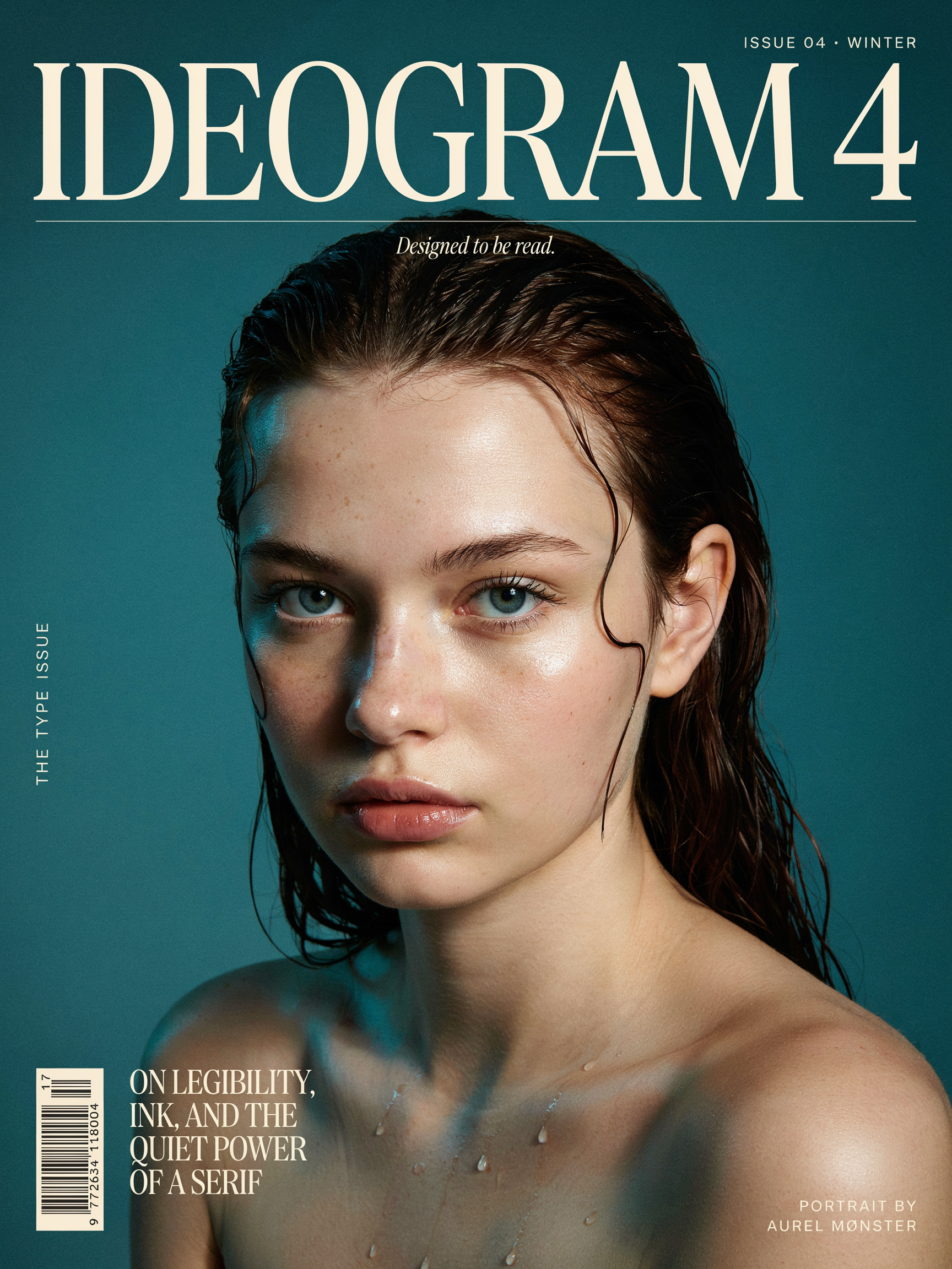
Quality · 3:4 · 3 credits
A premium magazine cover. Large bold title text "IDEOGRAM 4" across the top and a smaller tagline "Designed to be read" beneath it. Striking close-up editorial portrait of a woman with freckles and wet hair, dramatic studio lighting, deep teal background. High-fashion typography, photorealistic, sharp detail.
Put every word you want rendered in "quotes" and say where it goes ("across the top", "beneath it"). Ideogram 4 places and kerns multiple text blocks while keeping the portrait photoreal — the Quality tier is worth it for a hero.
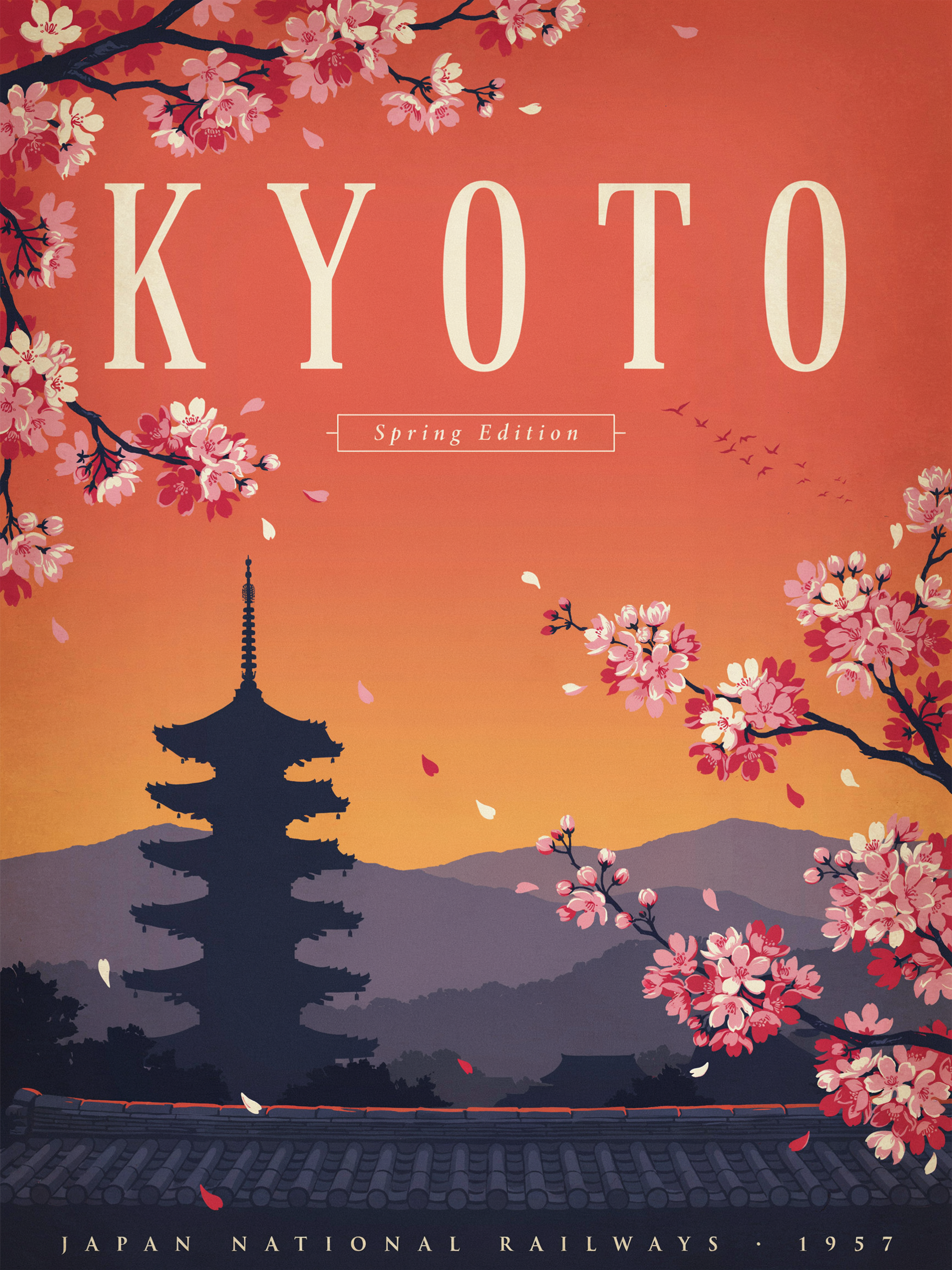
Quality · 3:4 · 3 credits
Vintage travel poster for "KYOTO" in elegant tall serif lettering, cherry blossoms framing a pagoda at sunset, warm gradient sky, subtle screen-print texture, balanced typographic layout with a small caption that reads "Spring Edition".
Name the lettering style ("tall serif") and the print look ("screen-print texture"). Ideogram nails the big display word and the small caption at once — describe both so neither gets dropped.
Balanced · 1:1 · 2 credits
Clean minimalist brand identity sheet for a coffee roaster named "EMBER & OAK". A crisp wordmark, a small flame-and-leaf icon, warm earth tones on a textured cream background, with a product mockup of a kraft coffee bag. Flat lighting, designerly layout.
Ask for a "brand identity sheet" and you get the wordmark, an icon, a palette, and a mockup in one frame. Balanced is the sweet spot for logo exploration — fast enough to iterate, sharp enough to read.
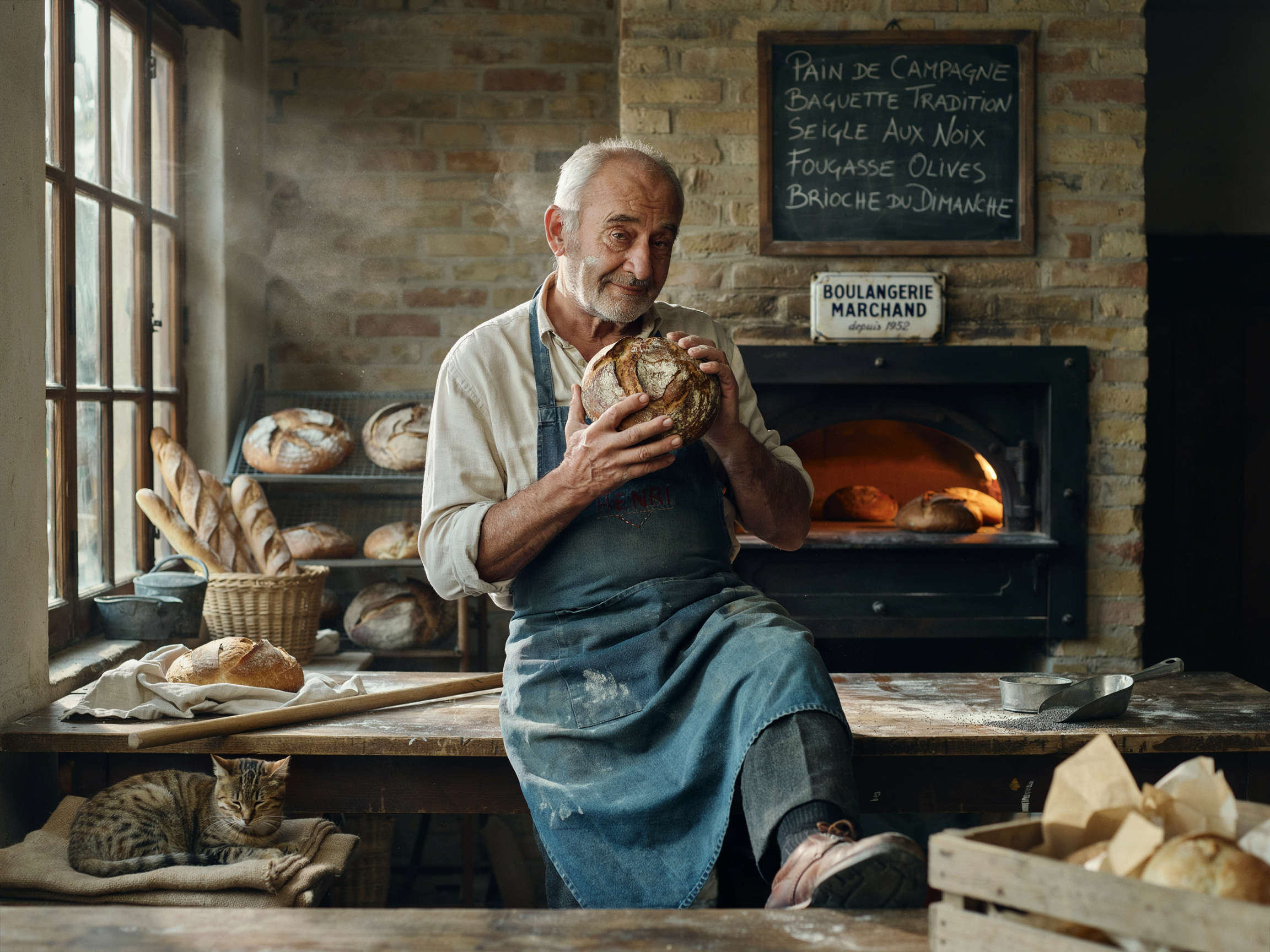
Balanced · 4:3 · 2 credits
Candid documentary photograph of an elderly baker dusted with flour, holding a fresh-baked loaf, soft window light in a rustic bakery, shallow depth of field, gentle film grain, natural skin tones.
"Documentary photograph" + "soft window light" + "film grain" anchors a believable, un-glossy look. Ideogram 4 holds realistic skin and texture without the plastic sheen — no text needed to show off its range.
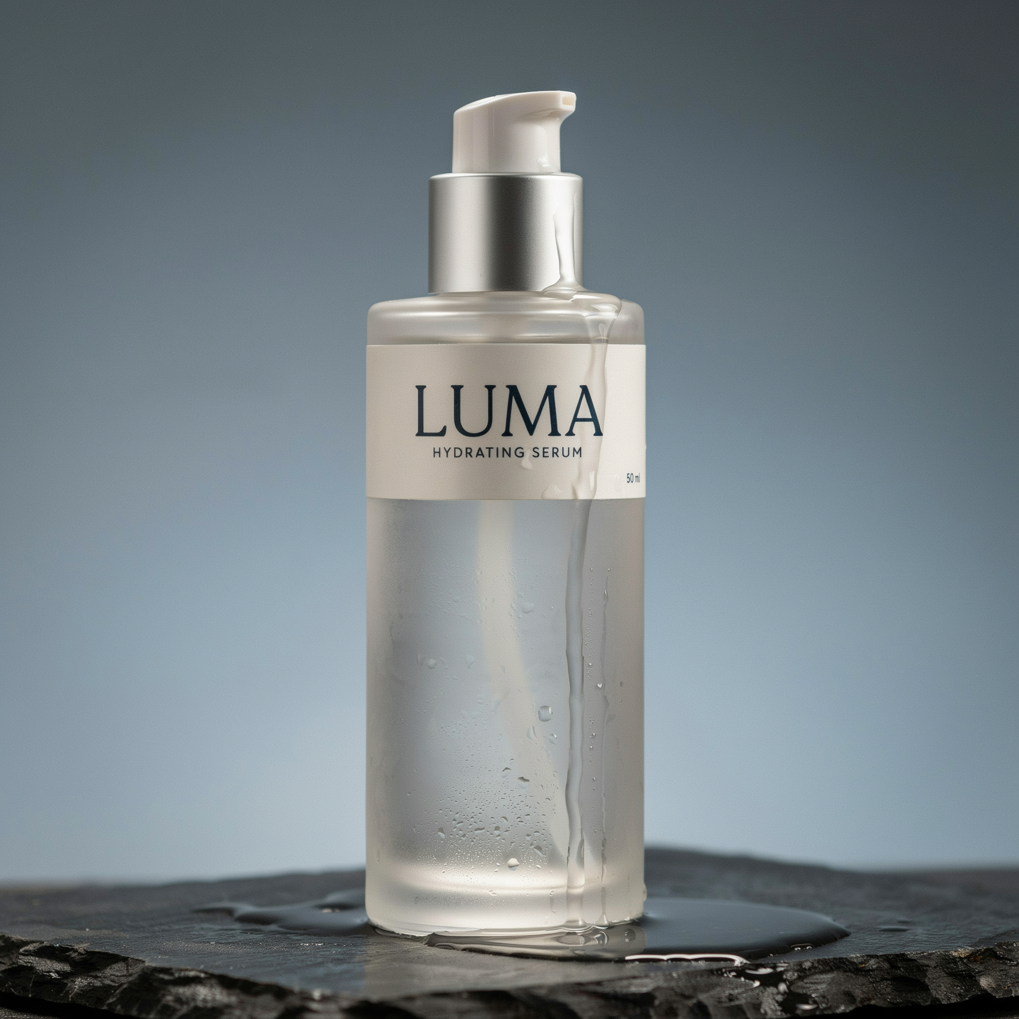
Turbo · 1:1 · 1 credit
Studio product shot of a frosted glass skincare bottle on a wet stone slab, soft rim light, water droplets, the label reads "LUMA" in clean sans-serif, minimalist composition, photorealistic.
Even on Turbo (1 credit) the label reads cleanly. Name the surface, the light, and the label text — perfect for cheap, fast e-commerce and ad-creative iterations before committing to a higher tier.
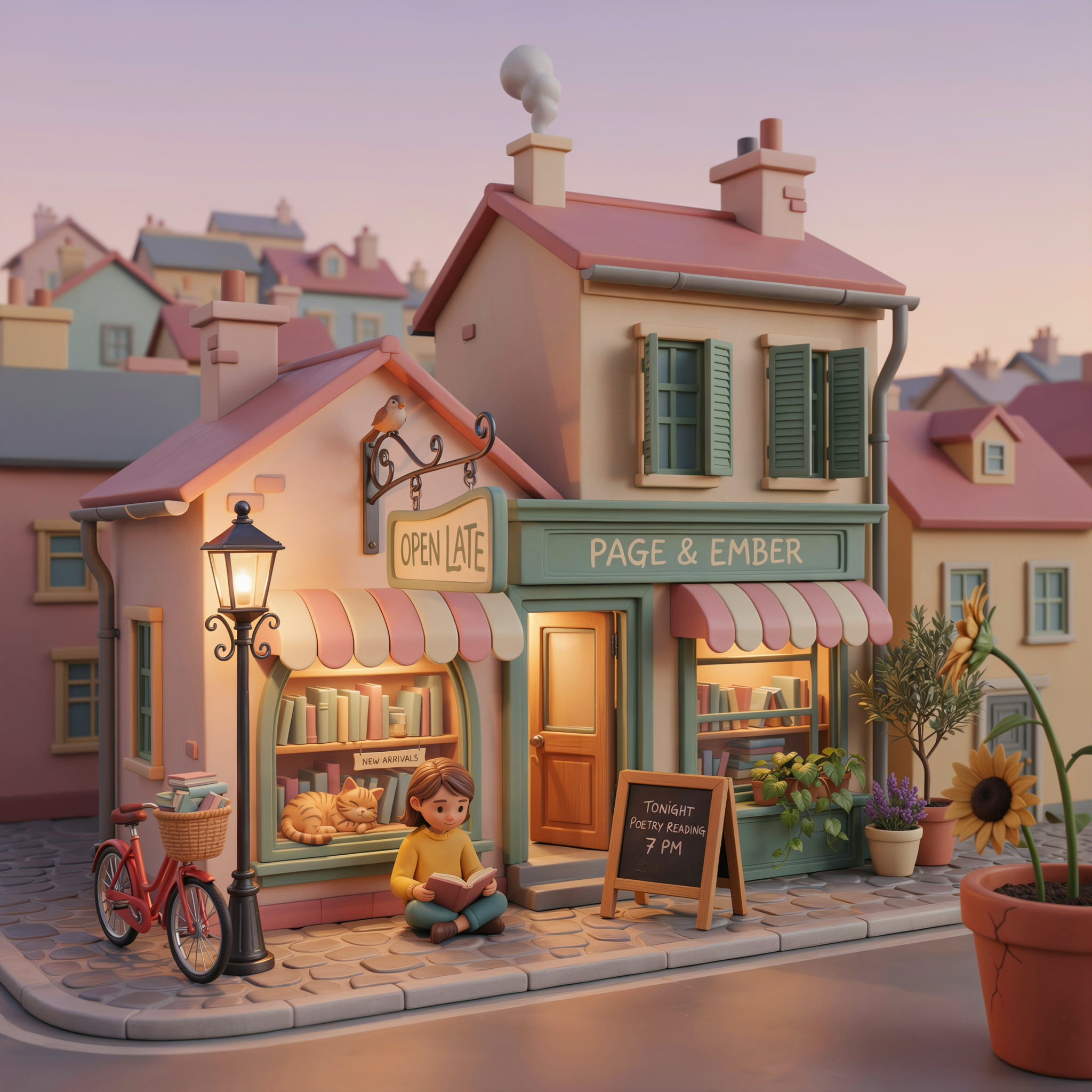
Turbo · 1:1 · 1 credit
A playful 3D isometric illustration of a tiny cozy bookstore, warm interior glow, a hand-lettered hanging sign that reads "OPEN LATE", soft pastel palette, clay-render style, gentle shadows.
Commit to a non-photo style explicitly ("3D isometric", "clay-render"). Ideogram still renders the hand-lettered sign — it carries its text strength into illustration, not just photoreal work.
Wrap any words you want rendered in double quotes — "OPEN LATE", "EMBER & OAK". Unquoted text is treated as description; quoted text is treated as type to render. This is the single biggest lever on Ideogram 4.
"title across the top", "small caption beneath", "label on the bottle". Positioning cues keep multiple text blocks from colliding and let Ideogram build a real layout instead of one floating headline.
Iterate composition and copy on Turbo (1 credit) where re-rolls are cheap. Once the layout works, re-run the exact prompt on Quality (3 credits) for the crispest letterforms and finest detail.
"tall serif", "clean sans-serif", "hand-lettered", "bold condensed". Ideogram renders type faithfully, so the typeface description is as important as the subject for design work.
Leave resolution on Auto and Ideogram picks the aspect ratio that best fits your prompt. Switch to an explicit size (square, 16:9, 9:16, ultrawide…) when your layout needs an exact shape.
Open with what it is — "magazine cover", "vintage travel poster", "brand identity sheet", "studio product shot". The format sets composition and hierarchy before Ideogram fills in the detail.
| Setting | Values | Notes |
|---|---|---|
| Tier | Turbo (1 cr) · Balanced (2 cr) · Quality (3 cr) | Same inputs across all three — only speed, fidelity, and cost differ. |
| Resolution | Auto · square · landscape · portrait · ultrawide (20+ sizes) | The only sizing control (no separate aspect-ratio field). Auto lets Ideogram choose. |
| Prompt | Natural language | Magic Prompt is applied automatically. Quote any text you want rendered. |
| JSON prompt | Structured JSON (API) | Use a structured prompt OR a natural-language prompt — not both. |
| Copyright detection | Off by default | Optional post-generation copyright check you can opt into. |
Rendering legible, well-placed text — posters, logos, packaging, book covers, and any design where the words have to be correct. It pairs that with strong photorealism and a real sense of layout, so it doubles as a dependable all-rounder for marketing and product visuals.