P-Image Ideogram Prompting Guide

P-Image Ideogram.
Words that actually render.

P-Image Ideogram is the Ideogram-backed model on the Pruna backbone. It is built for images that have to carry readable text. Posters, packaging, signage, book covers, labels, logos. You pick the thinking budget, so you pick the price: 0.1, 0.25, 0.5, or 1 credit per image.

P-Image Ideogram hero image with rendered lettering

Overview

Most image models treat lettering as texture. P-Image Ideogram treats it as content. Ask for a poster that reads "KYOTO" and you get those five letters, in the style you named, sitting where you said. That is the reason to pick this model over a general-purpose one.

The second reason is price control. A thinking budget sets how much reasoning the model spends on layout and letterforms before it renders. Very low costs 0.1 credits. Low costs 0.25. Medium costs 0.5 and is the default. High costs 1 credit. You can draft cheap and finish expensive on the same prompt.

This is a text-to-image model. There is no image input, no editing, and no image-to-image. Output is sized by preset: 1K or 2K, across seven aspect ratios. For editing an existing image, use P-Image Edit instead.

0.1 to 1

Credits per image

4

Thinking levels

2K

Max image size

Key Features

Reliable Text Rendering
Posters, signage, packaging

Reliable Text Rendering

Short strings render with correct letterforms and spacing instead of the usual scrambled glyphs. Put the exact words in quotation marks and name the lettering style. Headlines, product names, storefront signs, and label copy all hold up.

You Pick the Price
0.1 / 0.25 / 0.5 / 1 credit

You Pick the Price

The thinking parameter is the price dial. Very low at 0.1 credits for bulk drafts, low at 0.25 for simple scenes, medium at 0.5 as the everyday setting, high at 1 credit when the words must be legible. Same prompt, four budgets.

Layout Awareness
Type that sits where you asked

Layout Awareness

Say the headline runs across the top third and the subtitle sits under it in small caps, and the composition respects it. Useful for anything with a real design grid: exhibition posters, book covers, menu boards, album art.

Print and Product Surfaces
Kraft, gold leaf, enamel, screen print

Print and Product Surfaces

Text reads differently on paper than on glass or metal. Name the surface and the printing method, and the lettering picks up the right ink weight, texture, and edge. Screen print, letterpress, woodcut, foil, painted glass.

Preset Aspect Ratios
Seven ratios, 1K or 2K

Preset Aspect Ratios

Square, wide, tall, and the classic print ratios: 1:1, 16:9, 9:16, 4:3, 3:4, 3:2, 2:3. Ratios are presets by design, so there is no custom width and height on this model. Pick 2K when the text has to survive a zoom.

Prompt Upsampling
On by default

Prompt Upsampling

Short prompts get expanded before rendering, which helps when you write one line and want a full scene. Turn it off when your prompt is already precise and you do not want extra detail invented around your layout.

Example Images

Each example shows the exact prompt that produced the result. Copy any prompt with one click.

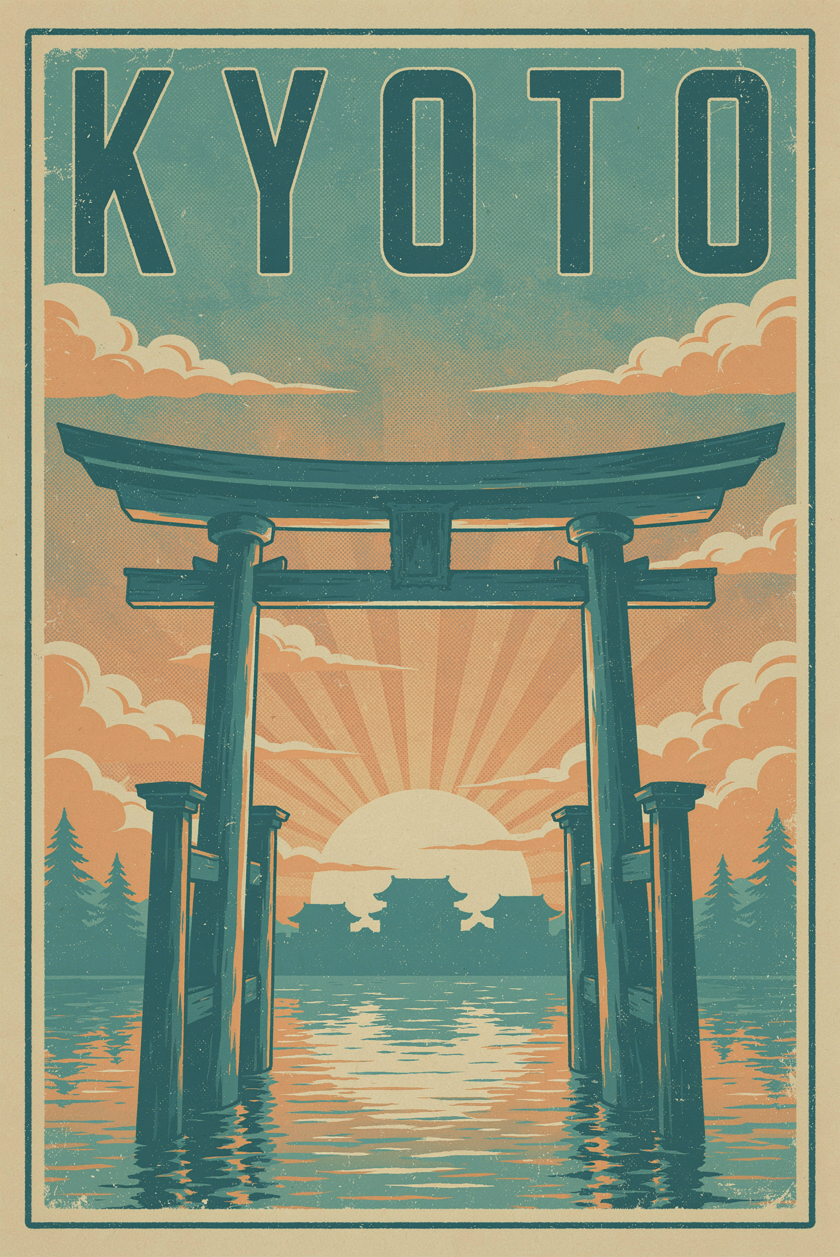
Kyoto Travel Poster

Kyoto Travel Poster

2:3 · recommended thinking: high · 1 credit

A vintage travel poster that reads "KYOTO" in tall condensed serif letters, torii gate at sunrise, muted teal and warm cream palette, screen-print texture, subtle paper grain

One short word in quotes, one named lettering style, one named print texture. Five letters is an easy target, so the model spends its budget on shaping the serifs rather than guessing at a sentence.

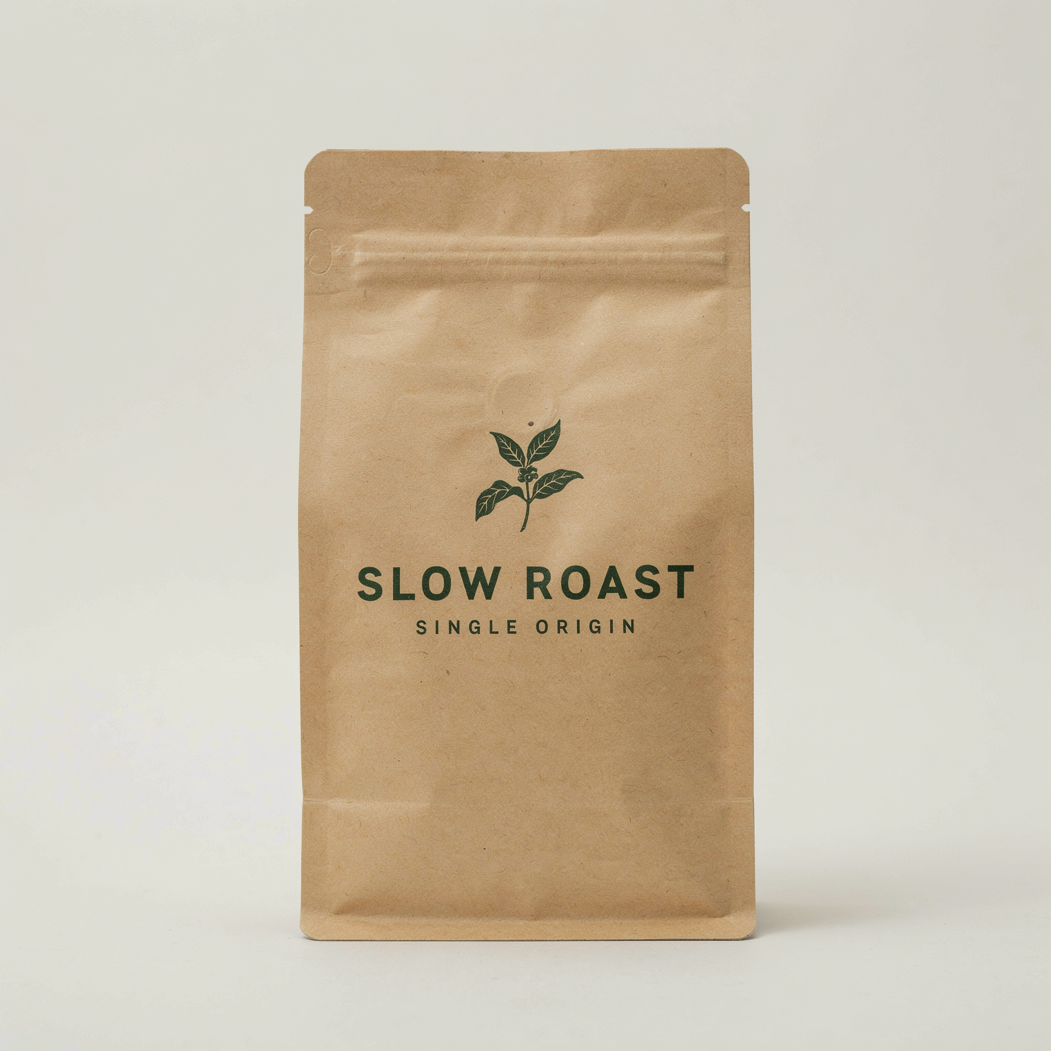
Slow Roast Coffee Bag

Slow Roast Coffee Bag

1:1 · recommended thinking: high · 1 credit

Minimal packaging design for a coffee bag labeled "SLOW ROAST", kraft paper texture, single dark green ink, small caps subtitle reading "single origin", studio product photo on a light backdrop

Two quoted strings with a clear hierarchy between them. Naming the second one as a small caps subtitle keeps it from competing with the main label. Single ink color on kraft is a forgiving surface for type.

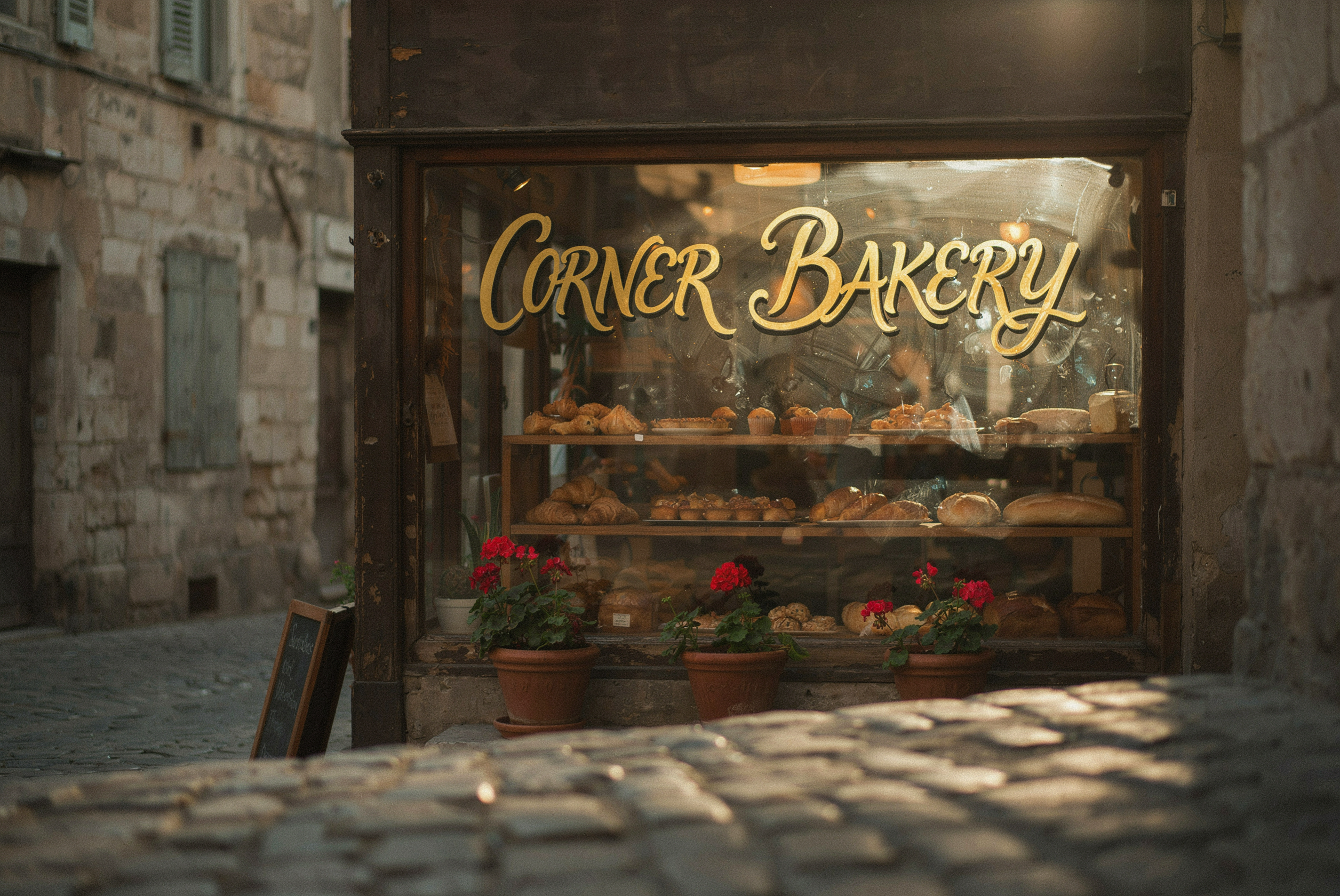
Corner Bakery Window

Corner Bakery Window

3:2 · recommended thinking: high · 1 credit

A hand-painted storefront window reading "CORNER BAKERY" in gold leaf script with drop shadow, warm morning light, shallow depth of field, pastries visible behind the glass

The surface does the work here. Gold leaf on glass with a drop shadow tells the model how the letters catch light. Shallow depth of field keeps the background from stealing detail from the sign.

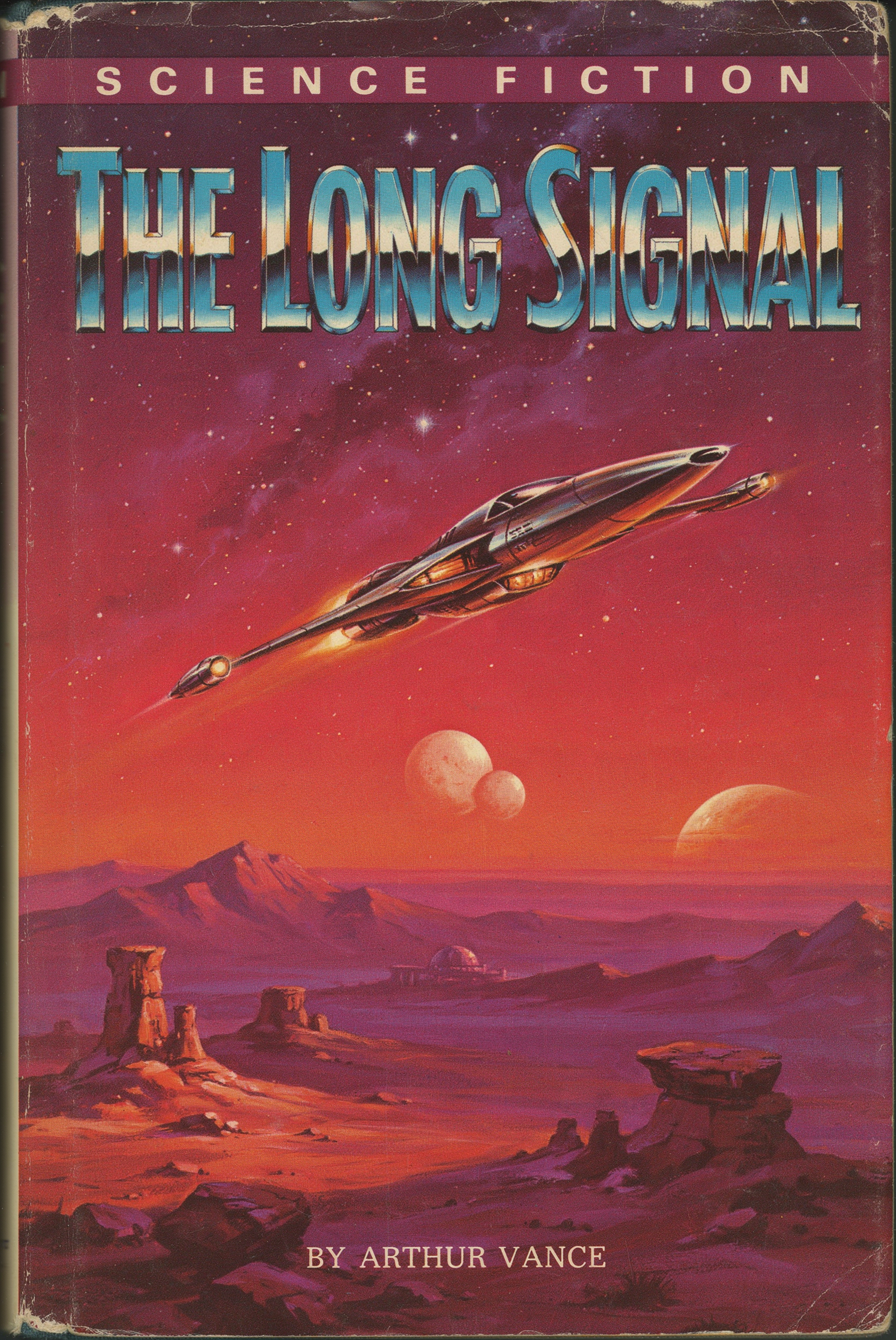
The Long Signal Paperback

The Long Signal Paperback

2:3 · recommended thinking: high · 1 credit

A retro science fiction paperback cover titled "THE LONG SIGNAL", chrome lettering with a starfield behind it, 1970s airbrush style, orange and violet gradient sky

A three-word title is near the practical limit for crisp rendering. Pairing a material for the letters, chrome, with a period style, 1970s airbrush, fixes both the type treatment and the art direction in one line.

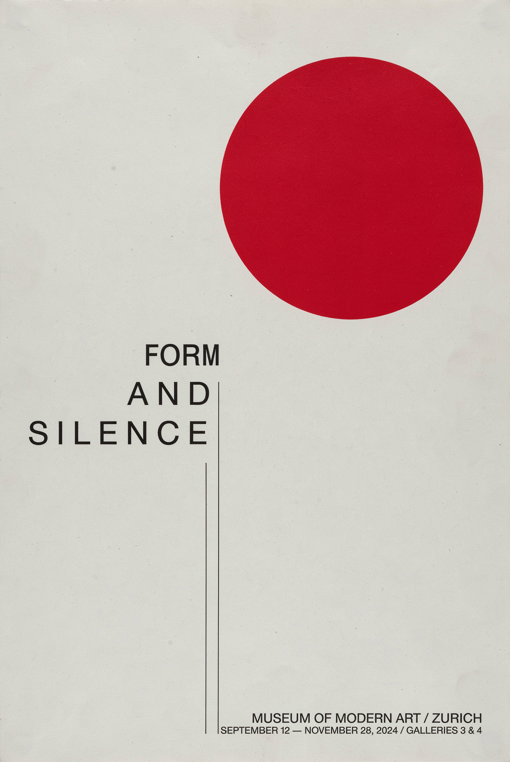
Form and Silence Exhibition

Form and Silence Exhibition

2:3 · recommended thinking: high · 1 credit

A modernist museum exhibition poster reading "FORM AND SILENCE" in thin uppercase letterforms, generous white space, one bold red geometric shape, Swiss design grid

Empty space is a prompt instruction. Asking for generous white space and a single accent shape gives the type room, which is exactly when thin uppercase letterforms stay clean instead of closing up.

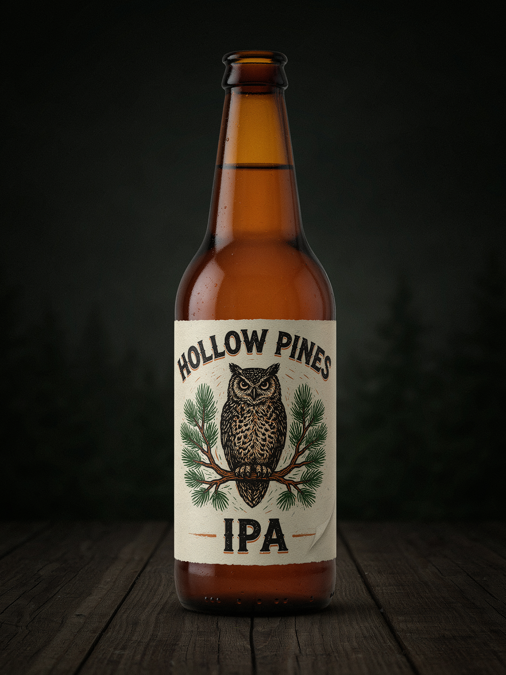
Hollow Pines IPA Label

Hollow Pines IPA Label

3:4 · recommended thinking: high · 1 credit

A craft beer label design reading "HOLLOW PINES IPA", woodcut illustration of an owl, three-color print, cream label on an amber bottle, dark moody backdrop

Constraining the palette to a three-color print keeps the text and the illustration in the same visual system. Naming the label stock and the bottle color separates the type layer from the product photo around it.

Prompting Tips

Quote the exact words

Anything inside double quotation marks is treated as literal copy to render. Anything outside them is treated as scene description. This one habit is the difference between a poster that says "KYOTO" and a poster covered in letter-shaped noise.

Keep strings short

One to three words render most reliably. A short headline plus a short subtitle is fine. A full paragraph of body copy is not what this model is for. If you need a wall of text, render the layout and set the small copy yourself.

Name the lettering, not just the mood

Condensed serif, thin uppercase, gold leaf script, chrome, woodcut, small caps. A named type treatment gives the model something specific to draw. "Nice typography" gives it nothing.

Say where the text sits

Across the top third, centered on the label, painted on the window, running up the spine. Placement instructions keep the words out of the busiest part of the image, which is where letterforms usually break down.

Draft cheap, finish expensive

Run six variations at very low for 0.6 credits total to find the composition you like. Then re-run the winner at high for 1 credit. You spend a fraction of what six high-thinking renders would cost.

Turn off prompt upsampling for tight layouts

Upsampling is on by default and helps short prompts. When you have written a precise layout brief, switching it off stops extra elements from being invented around your carefully placed headline.

Use 2K when the type is small

Small caps subtitles, label fine print, and dense poster grids all read better at 2K. For thumbnails and quick concept passes, 1K is plenty and renders faster.

Pin a seed once the layout works

When the composition lands, note the seed. You can then change palette or surface wording while keeping the same underlying layout, instead of rolling the dice again.

Choosing Your Thinking Budget

Thinking is the one setting that changes what you pay. It sets how much reasoning the model spends on composition and letterforms before rendering. There are four levels and the price scales with them.

Very low, 0.1 credits. Bulk ideation and thumbnails. Use it when you want twenty rough directions and expect to throw away eighteen. Text will often be wrong at this level, so treat any lettering as placeholder.

Low, 0.25 credits. Simple compositions without text. A single subject, a clean background, an obvious focal point. Good value for scene and mood work where nothing has to be read.

Medium, 0.5 credits. The everyday default, and what the tool ships with. Handles most scenes and short text well. If you are not sure what to pick, start here and only move up if the words come out soft.

High, 1 credit. Use it whenever the image has to carry legible words or a complex layout. Posters, packaging, book covers, signage, multi-element grids. It is the most expensive level on this model and still only one credit per image, so do not be shy with it on final renders.

A practical rhythm: explore at very low, refine at medium, deliver at high. The prompt does not need to change between passes, only the budget.
A Framework for Getting Text Right

1. Put the exact words in quotation marks. Write reads "SLOW ROAST" rather than describing a coffee label. Quoted strings are treated as copy to render. Everything else is scene description.

2. Name the lettering style. Tall condensed serif, thin uppercase letterforms, gold leaf script, chrome, woodcut, small caps. A named treatment is a drawable instruction. A vague one is not.

3. Keep the text short. One to three words per string, with at most one headline and one subtitle. Long strings are where letterforms drift. If you need more copy, render the design and add the small text yourself.

4. Say where the text sits in the frame. Across the top third, centered on the bottle, painted across the window, stacked in the left margin. Placement keeps the type in clean space rather than fighting the illustration.

5. Describe the surface the text lives on. Kraft paper, painted glass, screen-printed poster stock, enamel pin, chalkboard, a cream label on amber glass. The surface determines ink weight, edge quality, and how light hits the letters, and it is the detail most people leave out.

Settings Reference

SettingValuesNotes
promptText, requiredScene description plus any literal copy in double quotation marks.
thinkingvery low · low · medium · highDefault medium. Costs 0.1, 0.25, 0.5, and 1 credit per image respectively.
image_size1K · 2KDefault 2K. Drop to 1K for faster drafts and thumbnails.
aspect_ratio1:1 · 16:9 · 9:16 · 4:3 · 3:4 · 3:2 · 2:3Presets only. There is no custom width or height on this model.
prompt_upsamplingtrue · falseDefault true. The model expands a short prompt before generating. Turn it off for precise layout briefs.
output_formatjpg · png · webpPick png when you want a lossless file for print or further design work.
seedInteger, optionalPin to keep a layout stable while you change other wording.

FAQ

It sets the reasoning budget the model spends on layout and letterforms before it renders, and it sets the price. Very low is 0.1 credits, low is 0.25, medium is 0.5, and high is 1 credit per image. Higher levels render text and complex layouts more reliably. Medium is the default.