Model comparison
Kling Image 4 vs Kling Image V3
We ran the same six prompts on Kling Image 4 and Kling Image V3, in the same shape and at 2K. One try each, nothing picked or re-rolled. Here is how they compare.
Try Kling Image 4The short answer
- Kling Image 4 goes up to 8K. Kling Image V3 stops at 2K.
- Kling Image 4 was much faster here. Every image came back in 40 to 47 seconds. V3 took 109 to 152.
- Kling Image 4 adds series of up to 10 matching images, product pages and website designs. V3 makes single images only.
- V3 costs less: 1 credit an image. Kling Image 4 is 1.75 at 2K.
- Both spelled almost every word right. V3 dropped the space in DEW NO. 5, and Kling Image 4 drew the wrong icon for one coffee step.
At a glance
| Kling Image 4 | Kling Image V3 | |
|---|---|---|
| Made by | Kuaishou (Kling) | Kuaishou (Kling) |
| Price at 2K | 1.75 credits | 1 credit |
| Highest resolution | 8K | 2K |
| Image series | 2 to 10 matching images | No |
| Product pages and websites | Yes | No |
| Reference images | Up to 10 | Separate edit tool |
| Time per image in this test | 40 to 47 seconds | 109 to 152 seconds |
Three signs in one photo

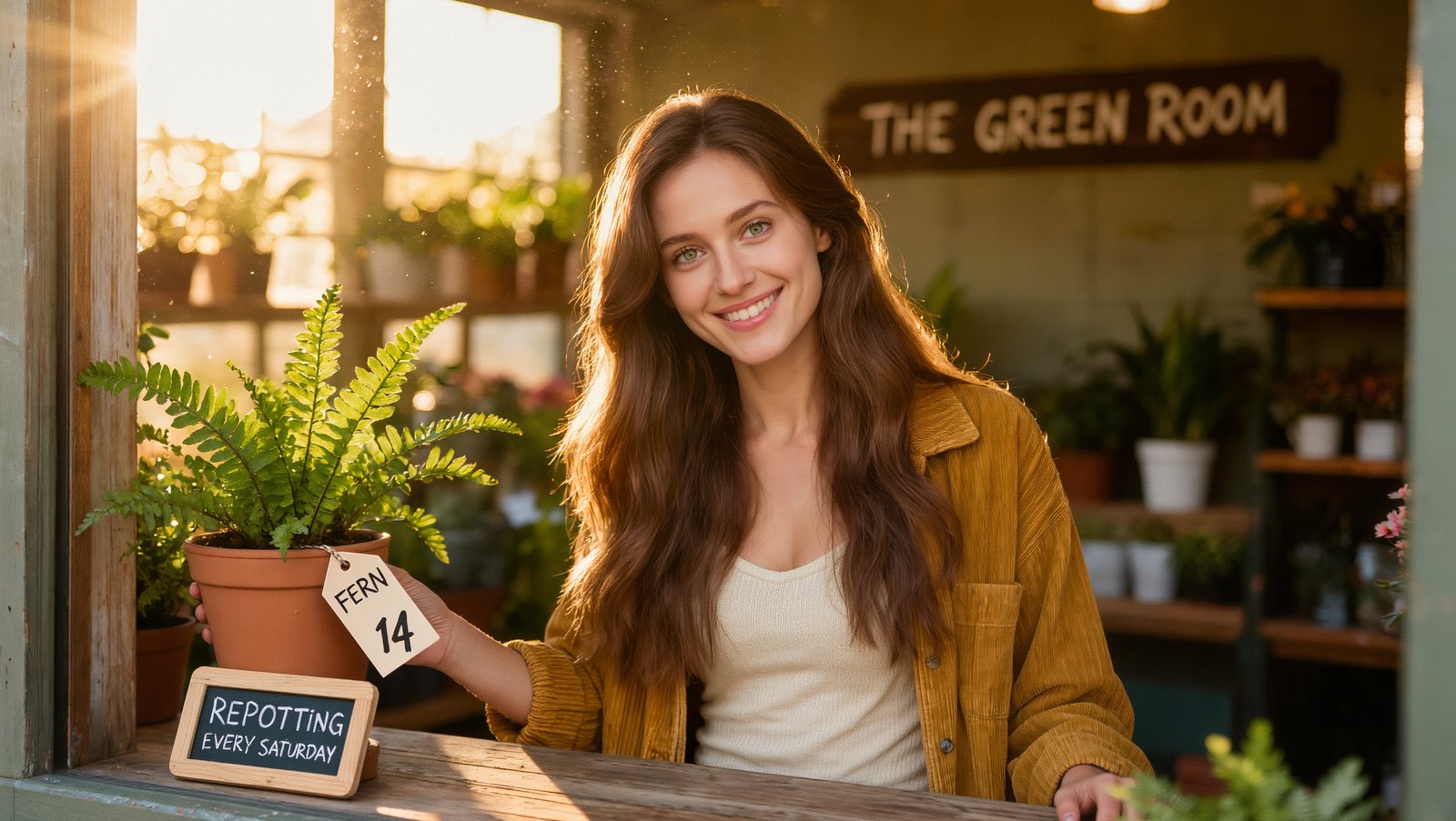
Both put all three signs in the shop: THE GREEN ROOM, the chalkboard and the FERN 14 tag. V3 made the tag big and easy to read. Kling Image 4 kept it small and tied to the pot, with warmer, softer light across the counter.
Photograph on a 35mm lens at eye level: a beautiful woman in her late twenties with long glossy chestnut hair, bright green eyes, flawless glowing skin and a radiant smile, in a fitted cream knit top and a mustard corduroy jacket, stands behind the counter of a small plant shop at golden hour, holding a terracotta pot with a fern. A hand painted wooden sign on the wall behind her reads "THE GREEN ROOM". A small chalkboard on the counter reads "REPOTTING EVERY SATURDAY". A paper tag tied to the pot reads "FERN 14". Low warm sun through the front window lighting her face, dust in the light, shelves of plants softly blurred, shallow depth of field, natural skin texture, the text must be exact, no other text anywhere.
Editorial portrait
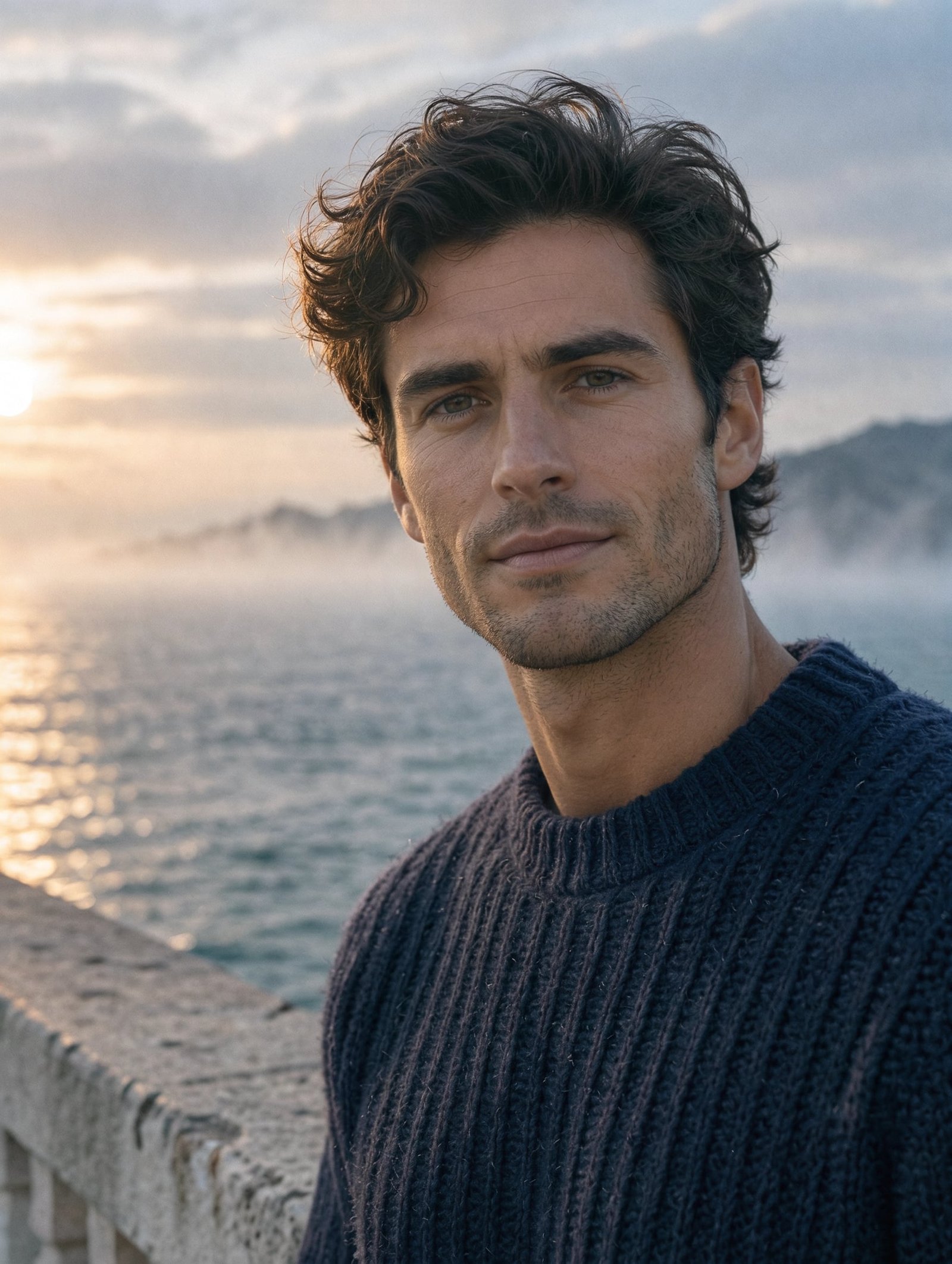
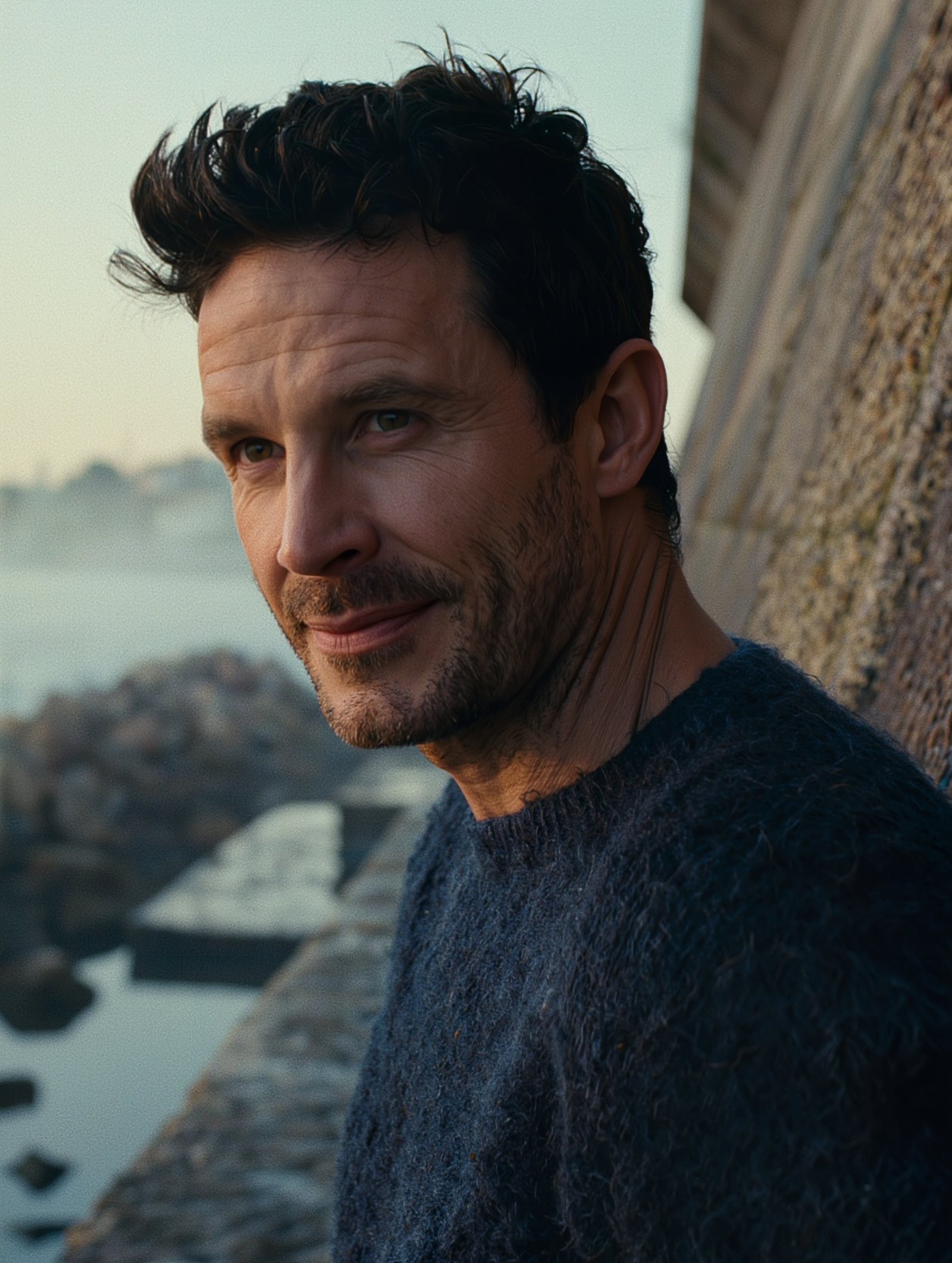
Kling Image 4 matched the brief closely: early thirties, light stubble, a ribbed navy sweater and mist on the water at sunrise. V3 made him look older and more weathered, with heavier stubble and a moodier harbor wall.
Tight beauty editorial portrait on an 85mm lens at f/2: a strikingly handsome man in his early thirties with thick dark tousled hair, a sharp jawline, light stubble and warm hazel eyes, in a navy fisherman sweater, turns toward the camera with a slight confident smile on a harbor wall at dawn as sea mist drifts behind him, soft silver light with a faint warm glow from the left, individual hairs and wool fibers visible, natural skin texture, fine color negative film grain, magazine cover quality, no text.
Product shot with a label
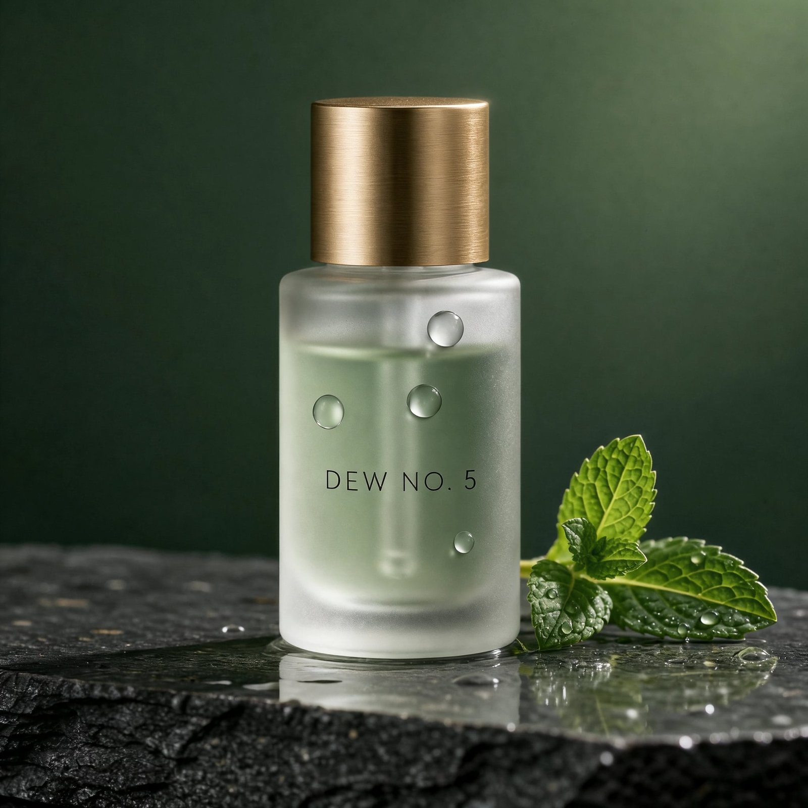
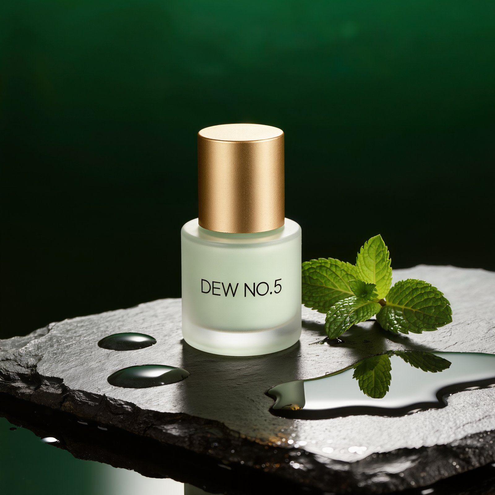
Kling Image 4 wrote DEW NO. 5 exactly, with water drops on the glass and mint on the slate. V3 wrote DEW NO.5 with no space and pooled the water on the stone instead. Both have the gold cap and the green backdrop.
Studio product photograph on a 100mm macro lens: a frosted glass bottle of pale green skincare serum with a brushed gold cap stands on a wet slab of dark slate, three water droplets on the glass, one sprig of fresh mint beside it, hard rim light from the right, soft fill from the left, deep forest green gradient background, crisp reflections, advertising quality, photoreal. The label on the bottle reads "DEW NO. 5" in thin black capitals, the text must be exact, no other text.
Concert poster
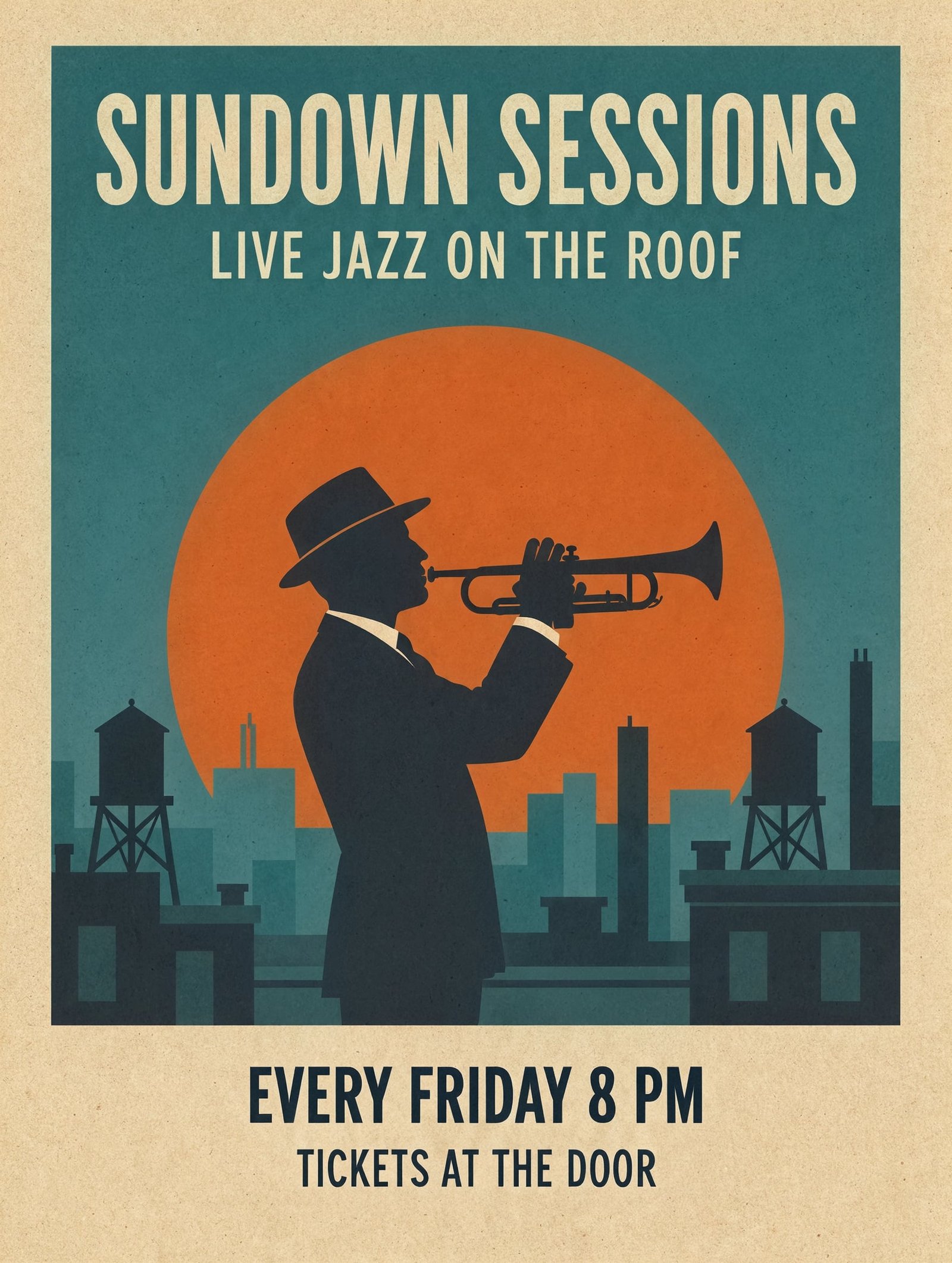
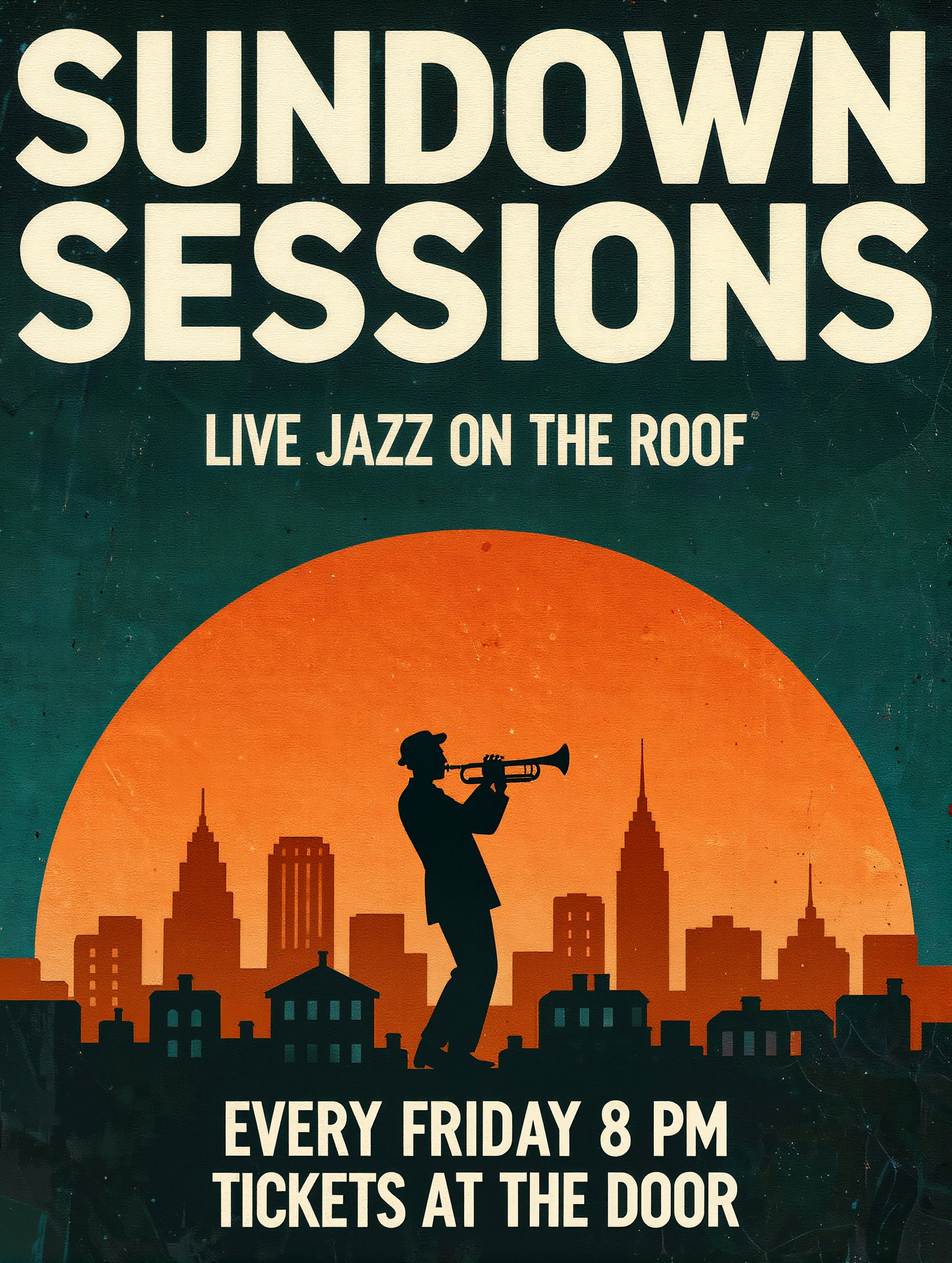
Every line is right on both. Kling Image 4 made a classic screen print with a paper border and water towers on the roofs. V3 went for a huge bold headline and a tall city skyline under the player.
Flat vector concert poster in a mid-century style. Headline at the top reads "SUNDOWN SESSIONS" in tall cream geometric capitals. Below it a smaller line reads "LIVE JAZZ ON THE ROOF". Central illustration: a trumpet player in silhouette against a huge orange sun with city rooftops below. At the bottom a line reads "EVERY FRIDAY 8 PM" and under it "TICKETS AT THE DOOR". Palette of burnt orange, cream, teal and charcoal, subtle paper grain, the text must be exact, no other text anywhere.
Infographic
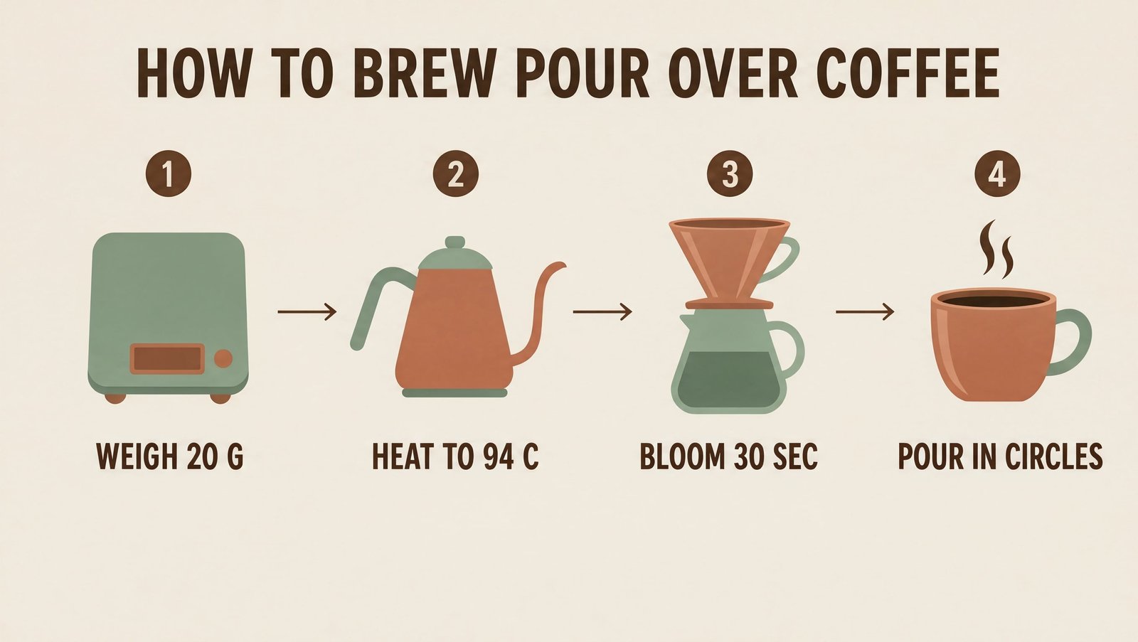
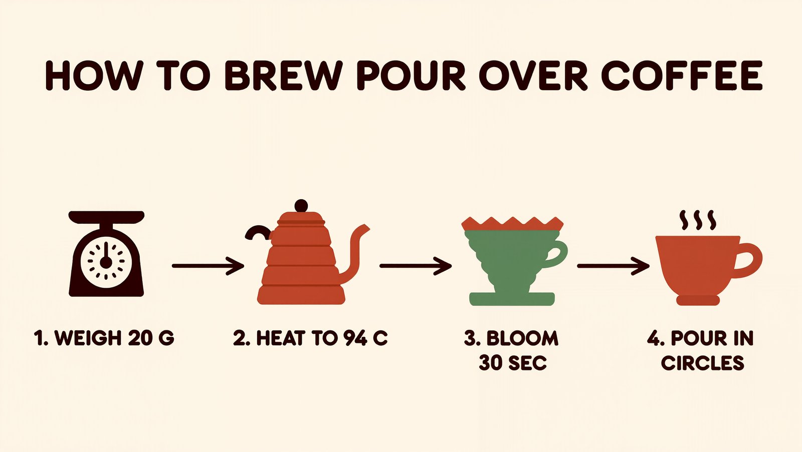
V3 wins this one. It drew a real scale for WEIGH 20 G and numbered every label. Kling Image 4 got the title and all four labels right, but its first icon looks like a toaster, not a scale.
Clean flat infographic on a cream background titled "HOW TO BREW POUR OVER COFFEE" in bold dark brown capitals at the top. Four numbered steps in a row, each with a simple icon and a short label under it: step 1 a scale icon with the label "WEIGH 20 G", step 2 a kettle icon with the label "HEAT TO 94 C", step 3 a dripper icon with the label "BLOOM 30 SEC", step 4 a cup icon with the label "POUR IN CIRCLES". Thin arrows between the steps, palette of dark brown, terracotta and sage green, the text must be exact, no other text anywhere.
Food photo
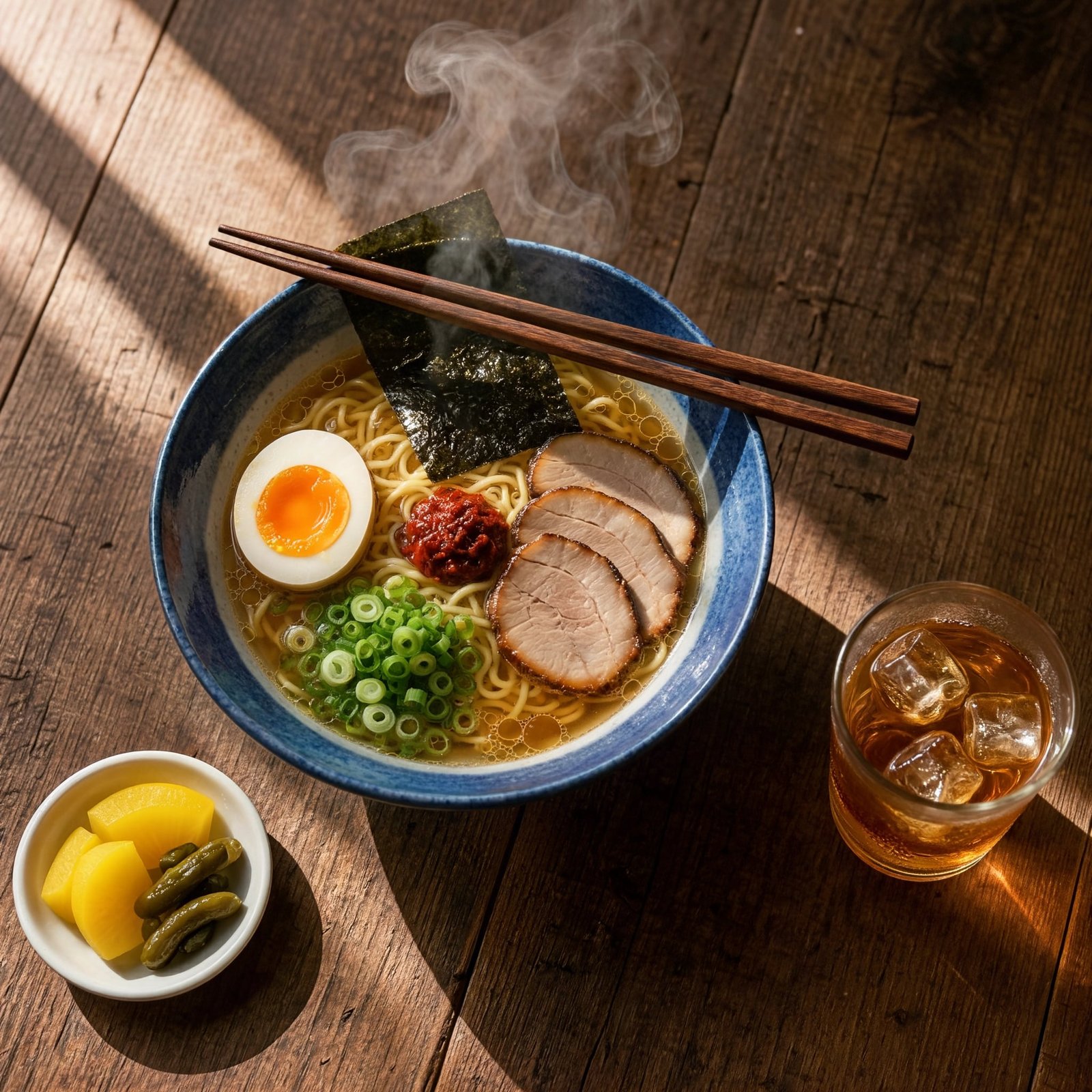
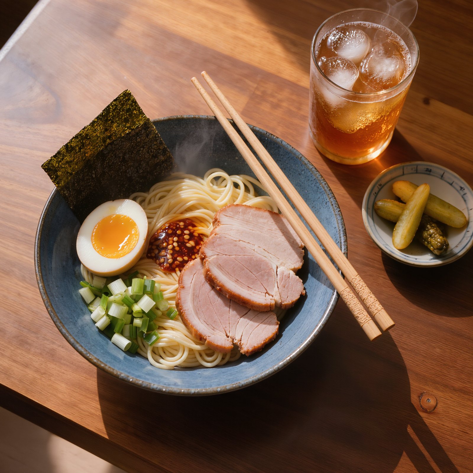
Both put in the egg, the pork, the nori, the chili oil, the pickles and the iced tea. Kling Image 4 stayed closer to overhead, with hard window light and long shadows. V3 came in at a lower angle and closer to the bowl.
Overhead food photograph on a 50mm lens: a blue ceramic bowl of ramen with a soft egg cut in half, three slices of pork, spring onion, a sheet of nori and chili oil catching the light, wooden chopsticks resting on the rim, a small dish of pickles and a glass of iced tea beside it on a dark walnut table, steam rising, hard window light from the top left with long shadows, photoreal, no text.
Run your own test
Both models are on Pixel Dojo. Copy any prompt above and try it on each.