Posters, infographics, grids
Layouts That Hold Together
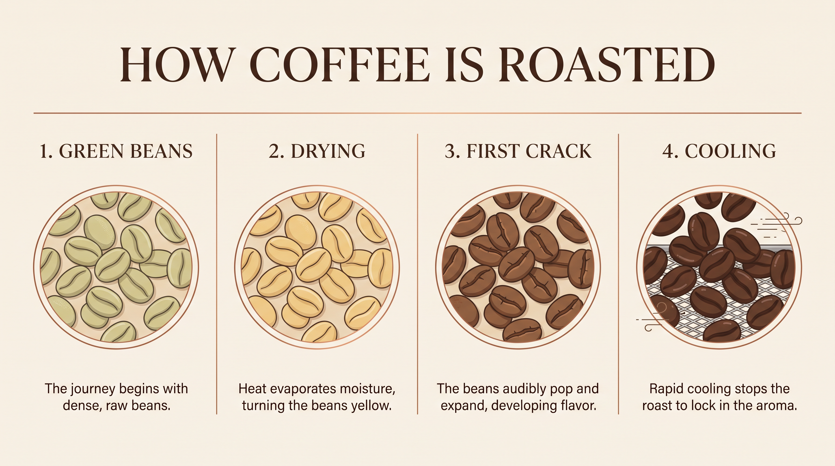
Describe the structure and the model keeps it: the title on top, four numbered panels, one caption under each, thin rules between them. This infographic follows the brief panel for panel.
Nano Banana 2.1 Prompting Guide
Nano Banana 2.1 is Google's newest model in the Nano Banana 2 family. It builds layouts that hold together, keeps people and products consistent from scene to scene, and makes precise edits that change only what you ask. It renders at 1K, 2K or 4K and takes up to 14 reference images. Every image on this page was made on PixelDojo with the prompt shown.
Nano Banana 2.1 rewards a prompt written like a creative brief. Say what the finished piece is (a poster, an infographic, an icon set, a product photo), how it is built, and what words appear on it. Structure you describe tends to come back intact: a three by three grid stays a three by three grid, and four panels get four captions.
The same tool does generation and editing. Leave the image slot empty for text to image. Add one to fourteen reference images and the prompt becomes an instruction: keep this person, recolor this product, put this pattern on that box.
On PixelDojo it is the default model in the Nano Banana generator, and it also runs Character Studio, Film Studio frames, Character Sheets, Consistent Characters, Image Relighting and Reality Polisher.
4K
Largest output
14
Reference images
10
Aspect ratios
Describe the structure and the model keeps it: the title on top, four numbered panels, one caption under each, thin rules between them. This infographic follows the brief panel for panel.
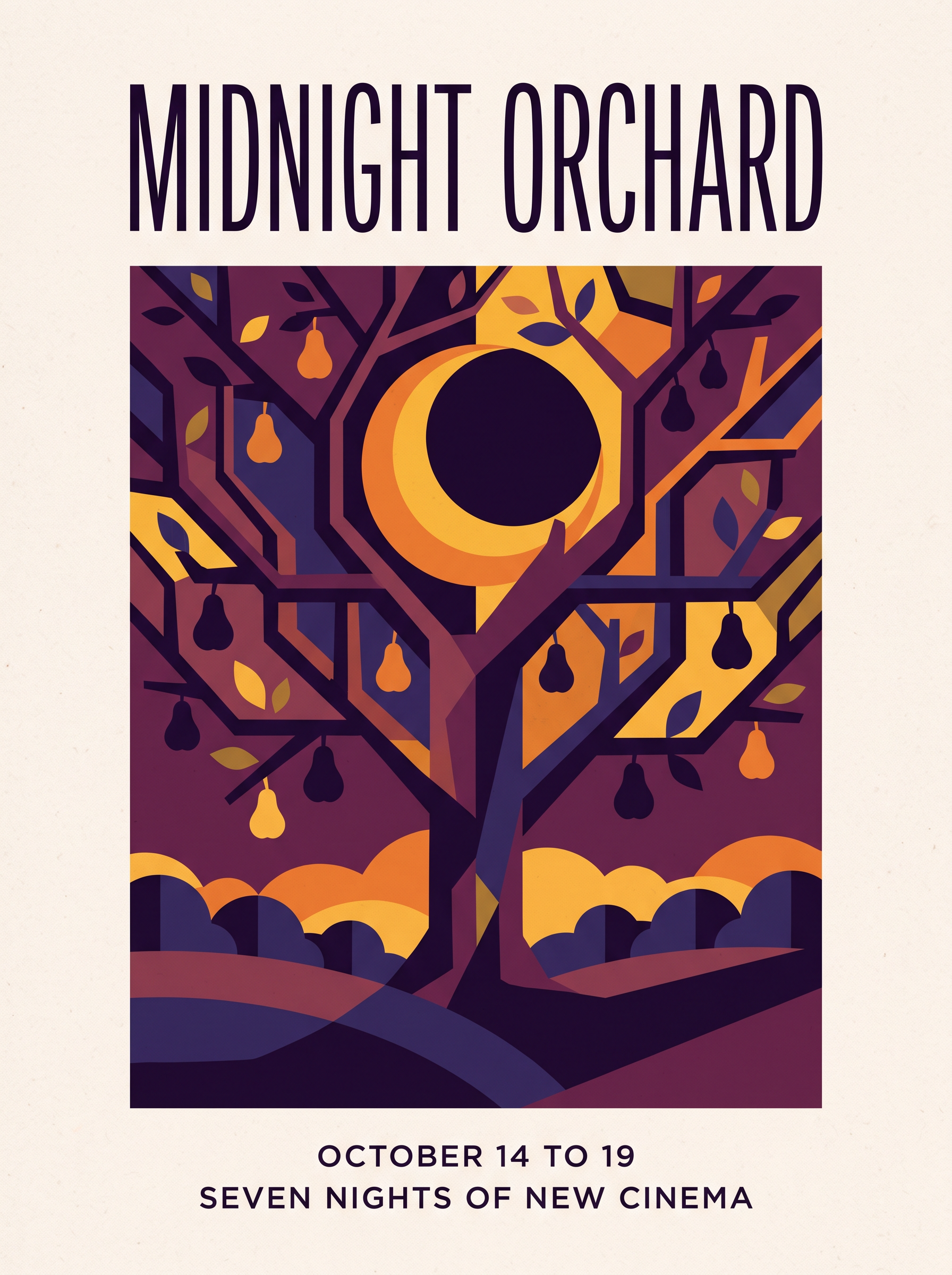
Write every word that should appear and where it goes. The festival title and both lines at the bottom of this poster came back letter for letter, in the type styles the prompt asked for.
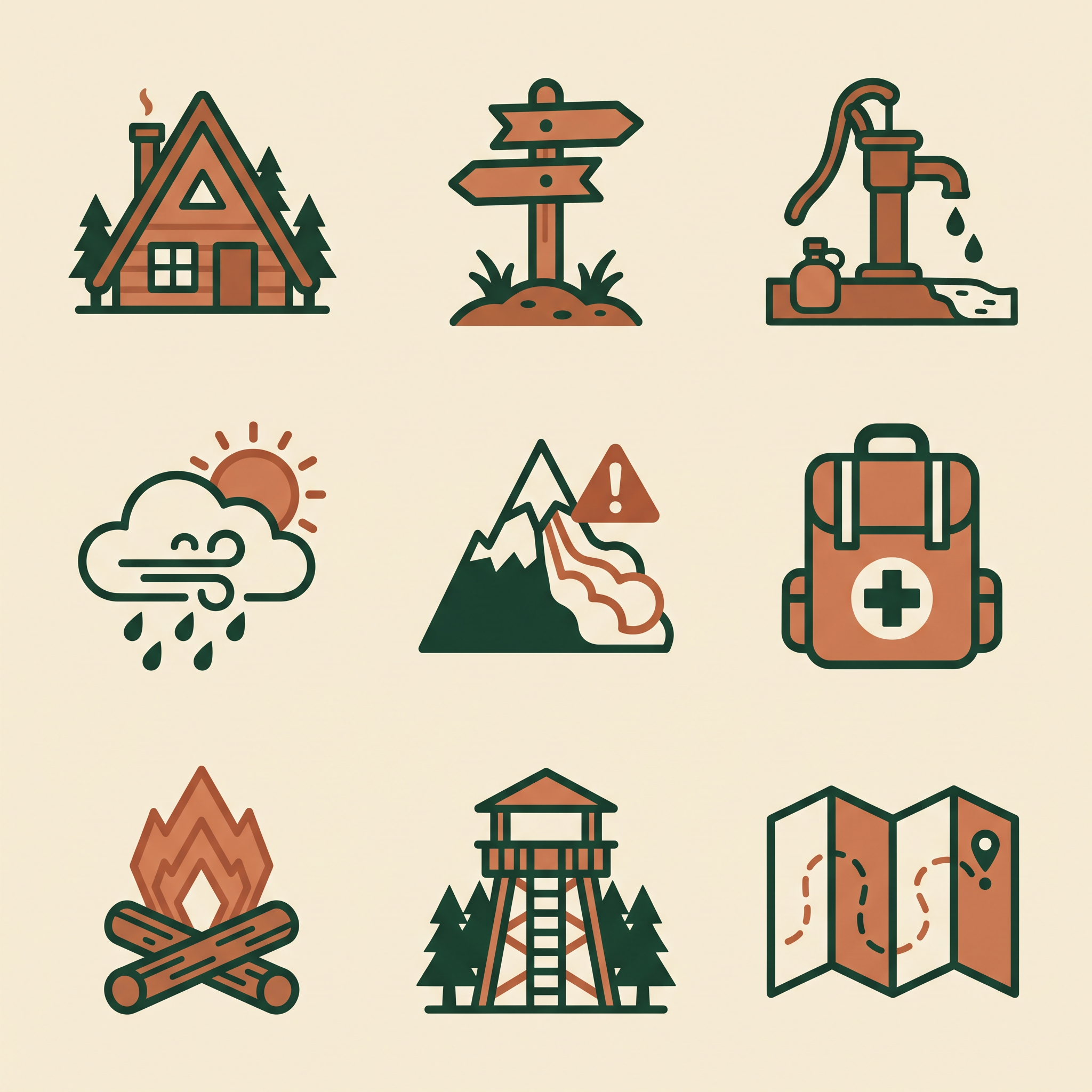
Ask for one stroke weight, one corner radius and a two color palette, and all nine icons share them. Name each icon in order and the grid fills in that order.
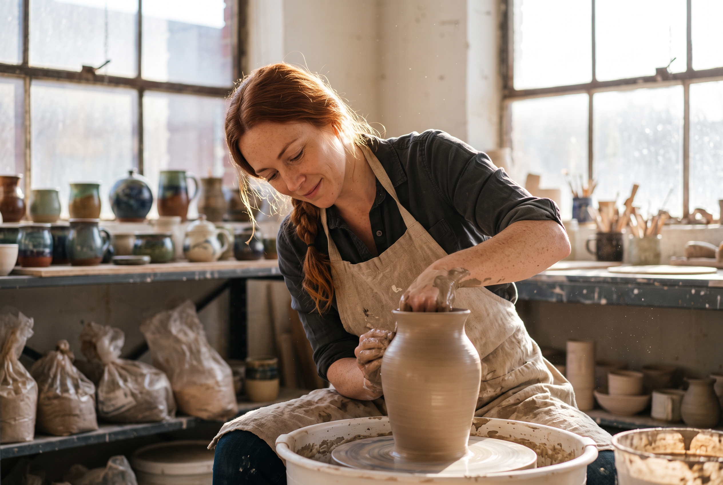
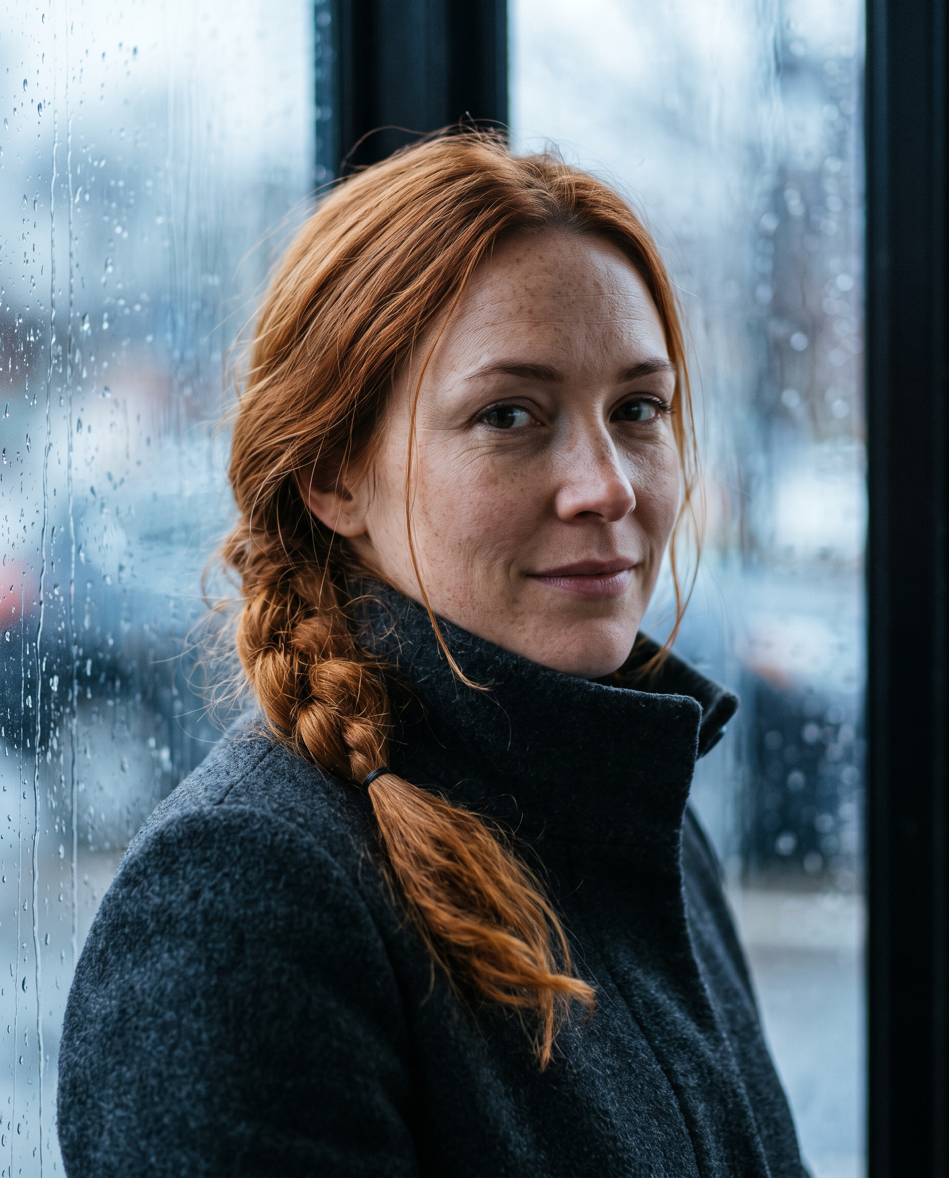
Attach a photo and name what to keep: the face, the copper braid, the freckles. From a single window portrait, the same woman appears at a pottery wheel in new light and new clothes.
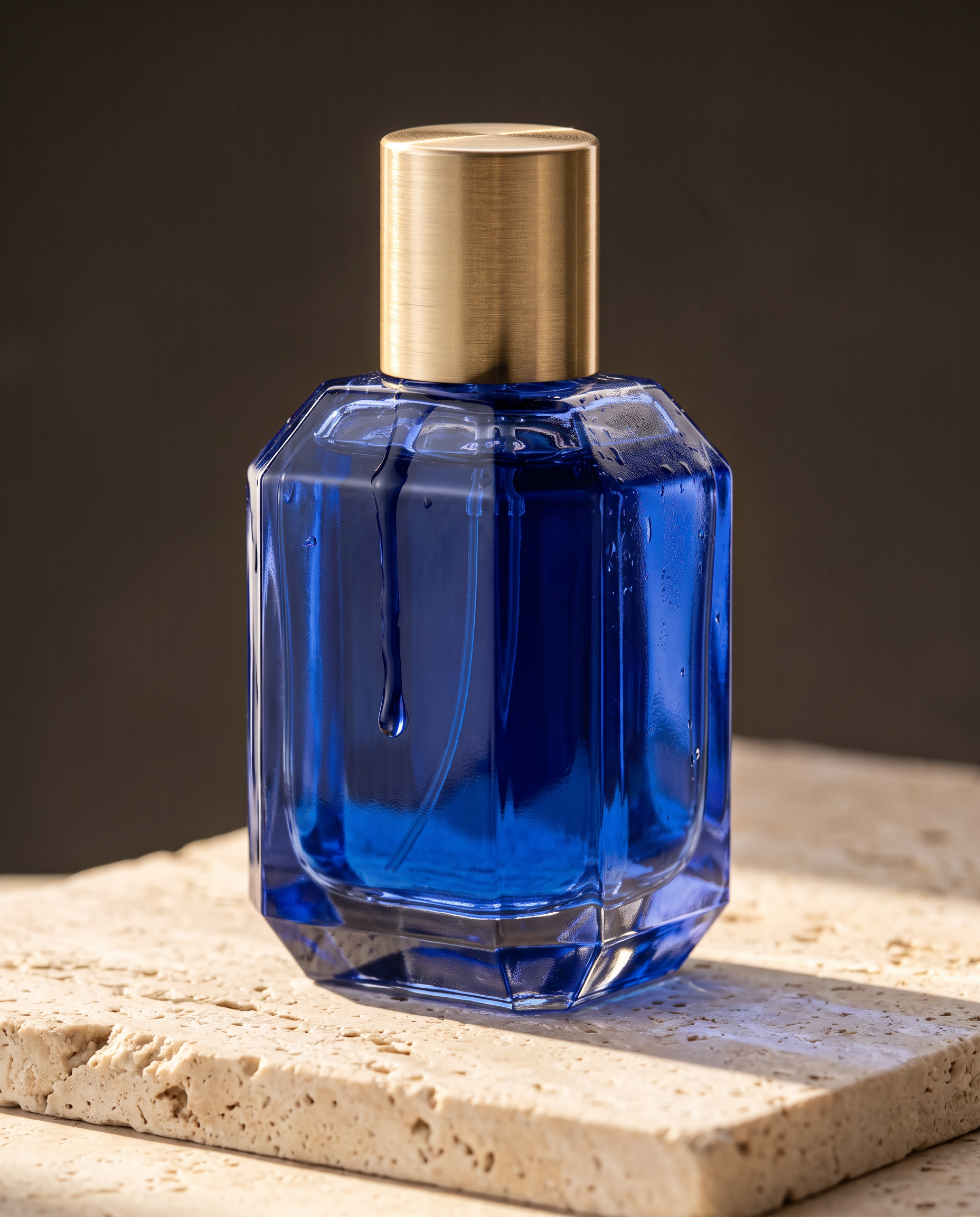
List the changes and tell it to keep everything else. This edit made three changes, cobalt glass, a travertine slab and morning sun, and the bottle, cap, drop and camera angle stayed put.
Every example here is 2K. Switch to 4K for print and large ads: a 3:4 poster comes back at 3584 x 4800. Ten aspect ratios run from 1:1 to 21:9.
Each example shows the exact prompt that produced the result. Copy any prompt with one click.
2K · 3:4 · 1.5 credits
A finished vertical poster for an independent film festival called MIDNIGHT ORCHARD. Bold flat geometric illustration of a crescent moon caught in the branches of a stylized pear tree, deep plum and saffron palette with fine paper grain. The title in tall condensed letters across the top, and the lines OCTOBER 14 TO 19 and SEVEN NIGHTS OF NEW CINEMA in a small clean sans serif along the bottom, generous margins, precise alignment.
Open with what the piece is ("a finished vertical poster"), give the illustration a style and palette, then place each line of type: the title across the top, two small lines along the bottom. "Generous margins, precise alignment" is the layout note that keeps it looking designed.
2K · 16:9 · 1.5 credits
A clean editorial infographic titled HOW COFFEE IS ROASTED, landscape layout with four numbered panels from left to right: GREEN BEANS, DRYING, FIRST CRACK, COOLING. Each panel has a precise flat illustration of the beans at that stage and a one line caption under it, warm cream background, espresso brown and copper accents, consistent icon style, thin rules dividing the panels.
Count the parts and name them in order: four panels, left to right, each with a label. Asking for "consistent icon style" and "thin rules dividing the panels" is what makes the four illustrations read as one system.
2K · 1:1 · 1.5 credits
A finished set of nine flat vector icons for a mountain hut hiking app, arranged in an even three by three grid on warm ivory: alpine hut, trail marker, water source, weather, avalanche risk, first aid, campfire, lookout tower, folded map. Two color style in deep forest green and terracotta, identical stroke weight and corner radius across every icon, no labels and no text.
List the icons in reading order and lock the shared rules: grid, palette, stroke weight, corner radius. "No labels and no text" keeps the set clean for use in an app.
2K · 4:5 · 1.5 credits
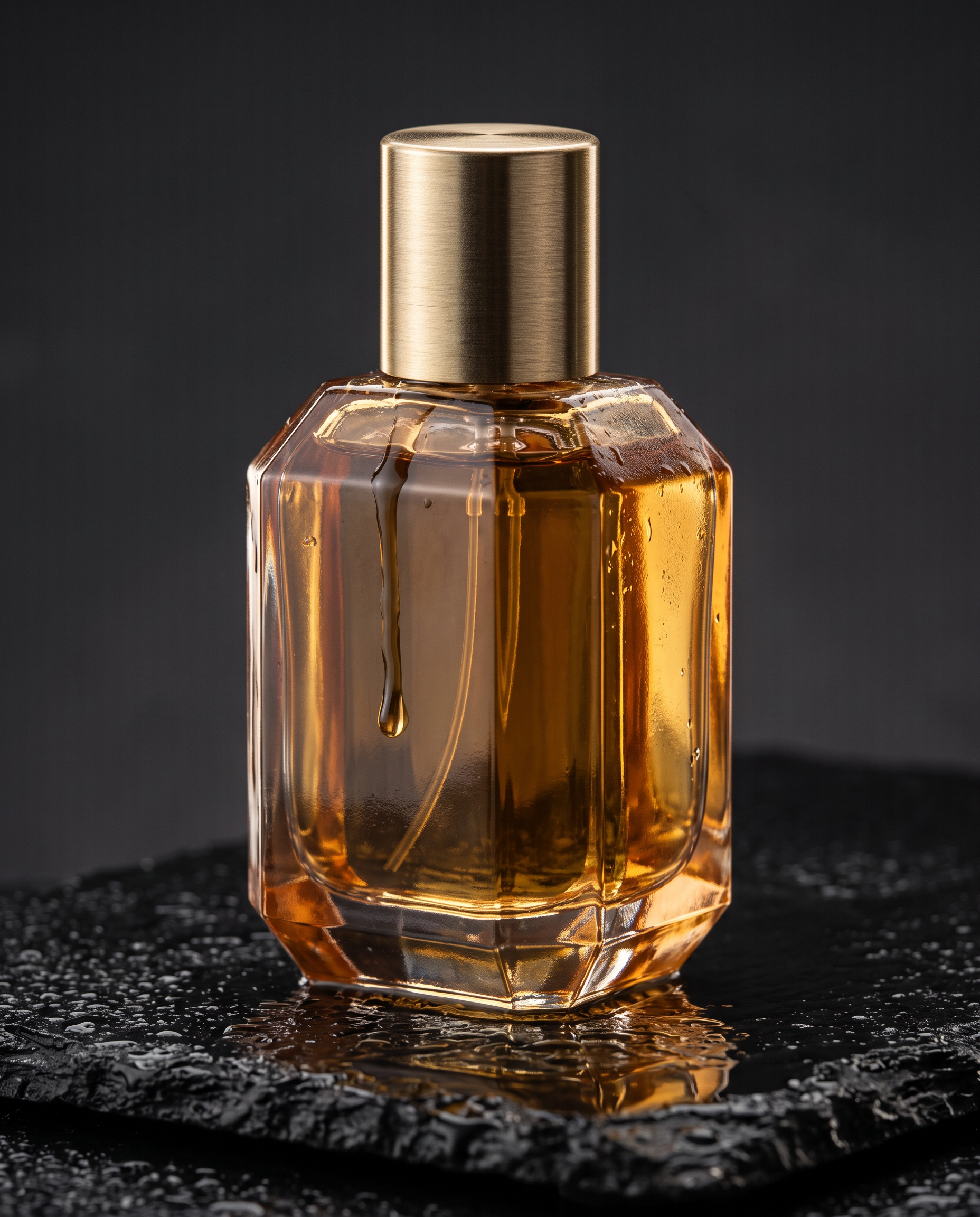
Studio product photograph, low three quarter angle on a 100mm macro lens. A faceted amber glass perfume bottle with a brushed brass cap stands on a slab of wet black basalt, a single drop running down the glass, soft rim light from behind turning the liquid honey gold, crisp reflections on the wet stone, dark charcoal backdrop, razor sharp detail on every facet.
Angle and lens first, then the product, the surface, one detail (the running drop) and the light. This shot is the before image for the edit below.
2K · 4:5 · reference = the product hero above · 1.5 credits
Edit the reference photograph with exactly three changes: make the glass and the liquid deep cobalt blue, replace the wet black stone with a slab of pale travertine, and light the scene with bright morning sun from the left. Keep the bottle shape, the brushed brass cap, the running drop and the camera angle exactly the same.
Say how many changes you want, list them, then list what must stay. Compare with the card above: the glass, the stone and the light changed, and nothing else did.
2K · 4:5 · 1.5 credits
Editorial portrait by a rainy window, medium close up on an 85mm lens. A woman in her early thirties with copper hair in a loose braid, freckles and a charcoal wool coat with the collar turned up, looking just past the camera with a calm half smile, rain streaked glass behind her throwing soft blue light, natural skin texture, fine film grain.
Give the person details you can recognize later (copper braid, freckles, a charcoal coat), then one expression and one light source. Those same details are what you name when you reuse her.
2K · 3:2 · reference = the portrait above · 1.5 credits
Use the reference image as the identity reference and keep the same woman clearly recognisable: same face, copper braid and freckles. Show her as a ceramicist at work in a sunlit pottery studio, shaping a tall vase on a spinning wheel, wet clay on her forearms, a linen apron, shelves of glazed pots behind her, warm afternoon light through dusty windows, documentary photograph on a 35mm lens.
Start with the job of the reference ("the identity reference") and the features to keep, then write the new scene as if from scratch: activity, wardrobe, setting, light and lens.
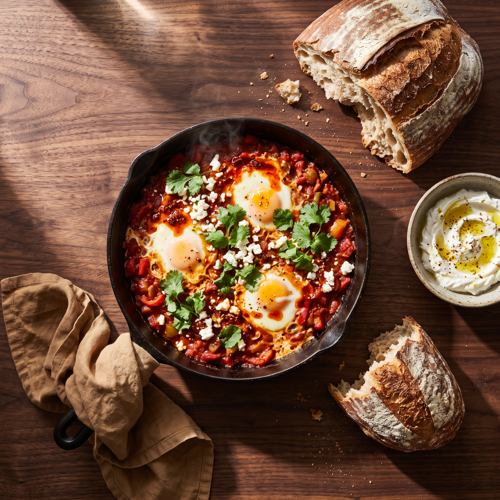
2K · 1:1 · 1.5 credits
Overhead food photograph on a dark walnut table: a cast iron skillet of shakshuka with three glossy eggs, crumbled feta, torn cilantro and a swirl of chili oil, a torn sourdough loaf, a small bowl of labneh and a rumpled linen napkin, hard morning side light with long shadows, a wisp of steam, rich saturated color.
List every prop you want on the table and the model sets all of them. "Hard morning side light with long shadows" gives the shot its direction and mood in one line.
Open with "a finished poster", "an editorial infographic" or "a set of nine flat vector icons". The word finished pushes it toward complete, usable design rather than a sketch or a mockup.
Four panels, three by three, two colors, one caption each. Counts and grids are instructions Nano Banana 2.1 follows closely, so write them down.
Every word that should appear, spelled the way it should print, with where it goes. Short lines in capitals set the cleanest. Proofread small print before you publish.
Say whether an image is the identity reference, the product, the setting or the style, and list what must stay the same. With several images, call them reference image 1, 2 and so on.
"Edit with exactly three changes", followed by the three changes and a keep list, gives the cleanest result. A big rewrite works better as a new prompt.
Shape the idea at 1K for 1 credit, then render the final at 2K (1.5 credits) or 4K (3 credits). A new resolution is a new image, so judge the final on its own.
Pick the aspect ratio for the job: 3:4 or 2:3 for posters, 16:9 for slides and infographics, 1:1 for icon sets and social posts, 4:5 for product shots.
Nano Banana 2 is still in the model picker. On the same infographic prompt it added its own tags and props, which suits a playful, illustrated page.
1. The deliverable. One sentence that says what you are making and its orientation: "A finished vertical poster for an independent film festival", "A clean editorial infographic, landscape layout".
2. The structure. How the piece is built: panels, grids, counts and reading order. "Four numbered panels from left to right", "an even three by three grid".
3. The content. The illustration or photo in each part, described concretely: "a crescent moon caught in the branches of a stylized pear tree", "the beans at that stage".
4. The copy. Every word that appears and where it sits: the title across the top, two small lines along the bottom, one caption under each panel.
5. The finish. Palette, type style, texture and spacing: "deep plum and saffron palette with fine paper grain", "generous margins, precise alignment". For photographs, this is the light, lens and film texture.
We ran the coffee infographic prompt above through both models at 2K. Nano Banana 2.1 returned exactly the brief: a title, four even panels and one short caption each. Nano Banana 2 made a busier, more illustrated page with extra tags, a burlap sack, roaster drums and longer captions. At 2K, Nano Banana 2.1 costs 1.5 credits and Nano Banana 2 costs 3.
Use Nano Banana 2.1 when the layout has to match what you asked for: client work, slides, product pages, icon systems. Reach for Nano Banana 2 when you want the model to add its own flourishes.
| Setting | Values | Notes |
|---|---|---|
| Prompt | string (required) | What to create, or the edit to make when reference images are attached. |
| Reference images | up to 14 (optional) | For edits, consistent characters and products, or style. Each between 5 KB and 20 MB. |
| Resolution | 1K · 2K · 4K | 1 credit at 1K, 1.5 at 2K, 3 at 4K. |
| Aspect ratio | 1:1 · 2:3 · 3:2 · 3:4 · 4:3 · 4:5 · 5:4 · 9:16 · 16:9 · 21:9 | Match Input keeps the shape of your reference when editing. |
| Images per run | 1 to 4 | Each image is billed separately. |
Nano Banana 2.1 is Google's updated image generation and editing model in the Nano Banana 2 family. It improves graphic composition, subject consistency and edit accuracy, works from text or up to 14 reference images, and renders at 1K, 2K or 4K.
Like a design brief: what the piece is, how it is structured, what goes in each part, the exact copy, and the finish. Counts and grids are followed closely, so write them down.
Attach a photo of the person, call it the identity reference, and name the features to keep, like face, hair and freckles. Then describe the new scene in full. Our pottery studio example kept the same woman from one portrait.
Attach the photo, say how many changes you want, list them, and list what must stay the same. Our perfume edit changed the glass color, the surface and the light, and kept everything else.
For layouts and edits that must match the brief, yes. In our infographic test it matched the four panel layout exactly, while Nano Banana 2 added extra decoration. Both are in the model picker, and Nano Banana 2.1 costs less.
It is included in every PixelDojo plan, from $10/month. An image costs 1 credit at 1K, 1.5 credits at 2K and 3 credits at 4K.
Yes. Call it as nano-banana-2-1 at /api/v1/models/nano-banana-2-1/run with prompt, aspect_ratio, resolution and reference_images. It is also in Canvas for generating and editing.